DISSECTING THE CAPYBARA DNA: A BRAND AUDIT
Before moving into the design phase, I performed a deep-dive audit of the Capybara Games brand ecosystem. My
goal was to move beyond the surface-level "cute" aesthetic and understand the technical rules that make their
identity so cohesive. I systematically gathered and categorized their core design assets—ranging from the
bubble-lettered "CAPY" logo variants to the hand-drawn, sticker-style iconography that defines their UI.
By breaking down their pattern library, I identified the signature "wavy line" motifs and freeform button
structures that give their web presence its organic, playful energy. This audit ensured that any new creative
applications would feel like an official, seamless expansion of the studio’s established world.

BREAKING DOWN THE DNA
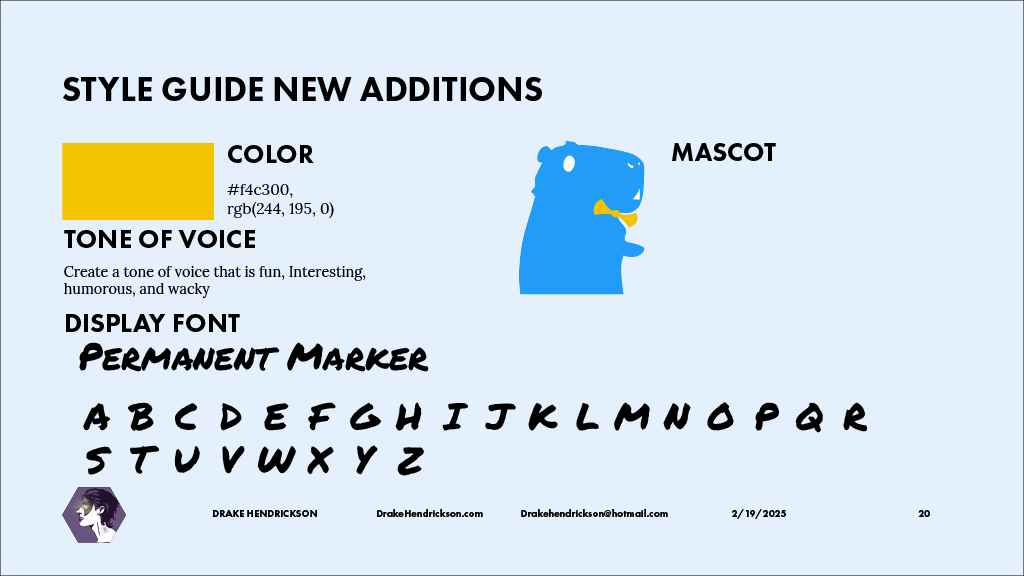
With a deep understanding of Capy’s organic architecture, I moved into the "build" phase to develop new,
official additions to their design system. My focus was on creating assets that felt "fun, interesting,
humorous, and wacky"—keeping in line with the studio's established tone of voice. I introduced a new Mascot
iteration: a vibrant blue capybara that utilizes the same hand-drawn, sticker-style silhouette found in the
original brand audit.
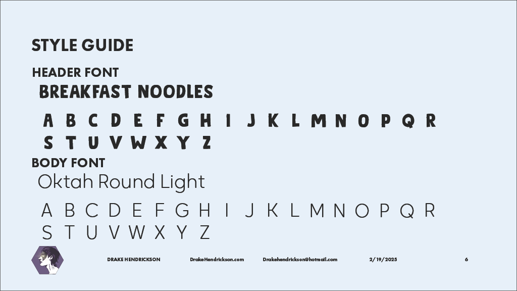
To complement this, I integrated a new display font, Permanent Marker, into the system. This choice maintains
the high-energy, DIY feel of the "Breakfast Noodles" header font while providing a fresh, aggressive
alternative for callouts and secondary headers. These additions aren't just decorative; they are functional
tools designed to keep the Capy brand feeling fresh and unpredictable across new digital platforms.
SYSTEM SYNERGY
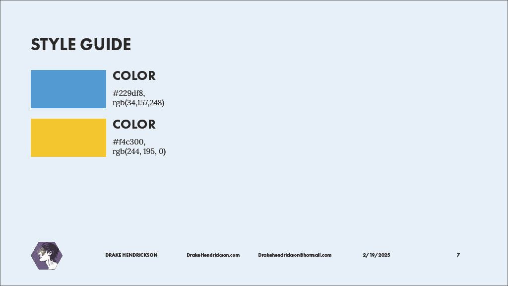
I carried over the core Sun Yellow (#f4c300) to anchor these new additions, ensuring they remain instantly recognizable as Capy assets. By documenting these "New Additions" in a structured style guide, I’ve provided a clear roadmap for how the brand can continue to grow without losing its signature charm.
FROM BLUEPRINT TO BUILD: THE FINAL ASSETS
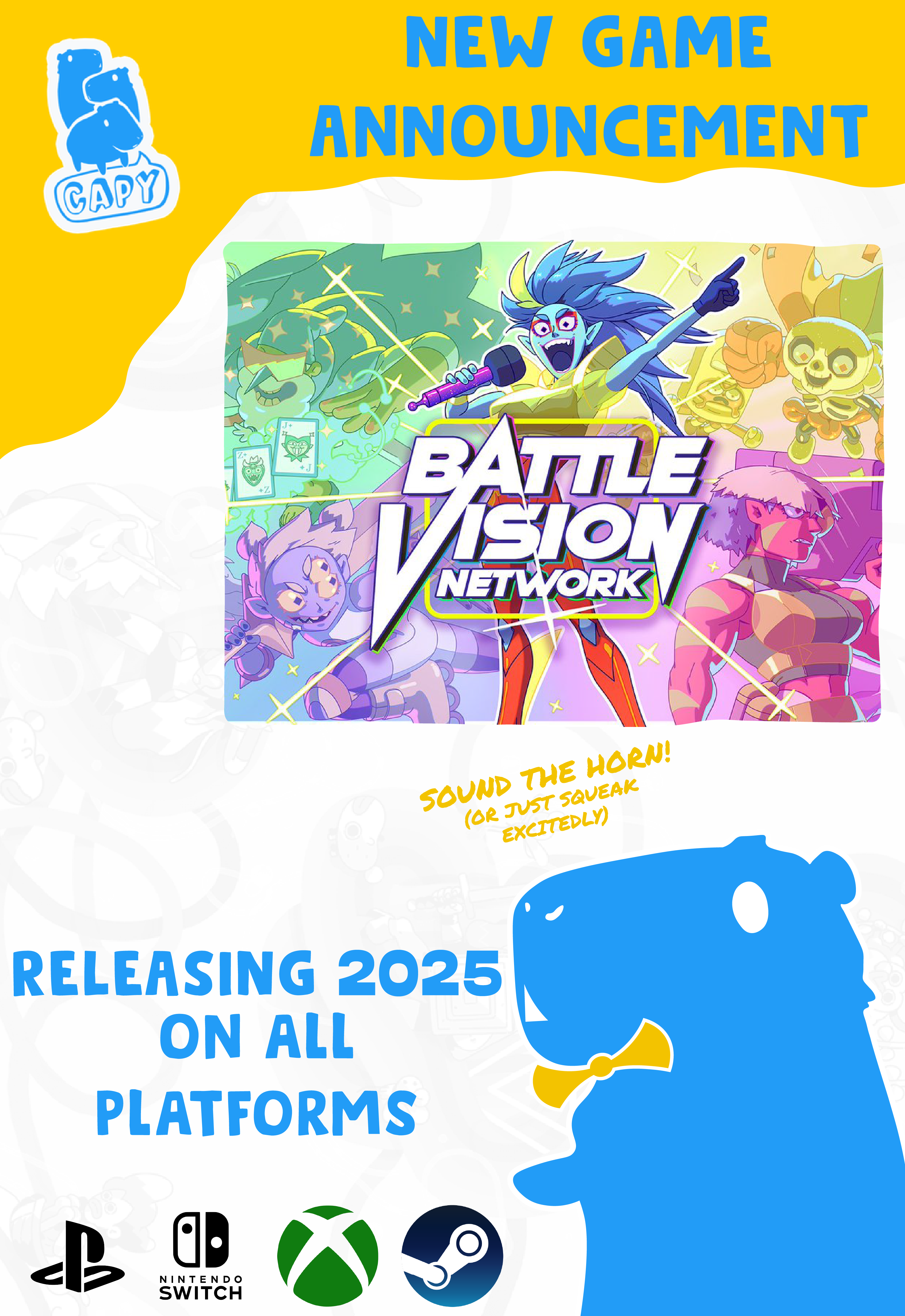
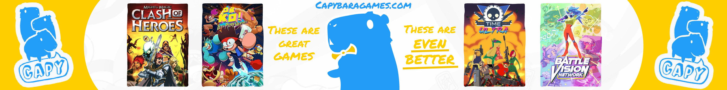
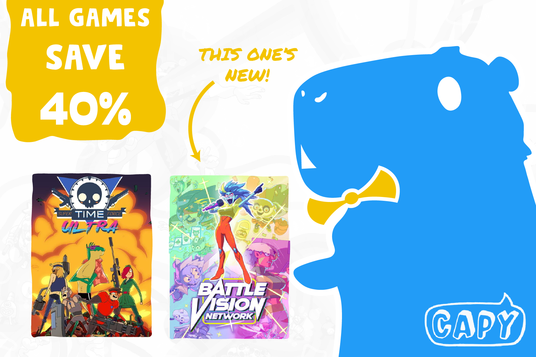
With the new style guide additions established, I moved into the final production of a comprehensive asset suite. My objective was to create a series of high-impact visuals that utilized the "wavy line" architecture and "freeform button" structures identified during the audit. I developed a new cinematic banner that showcases the studio’s portfolio—placing their iconic game titles like Clash of Heroes and Grindstone within a custom-built, vibrant yellow framework.
These assets were designed with modularity in mind, allowing the "sticker-style" mascot and custom iconography to be rearranged across various digital touchpoints. By combining the hand-drawn energy of the Permanent Marker typeface with the studio's signature sky blue and sun yellow, the final build achieves a professional, "market-ready" look while staying true to the wacky, independent spirit of Capybara Games.
EXECUTION & FIDELITY
I utilized a high-contrast "pop" effect on all character assets to ensure they remain the focal point against complex backgrounds. This technique, paired with a strict adherence to the new 16:9 cinematic grid, ensures that the brand extension is as technically sound as it is visually engaging.