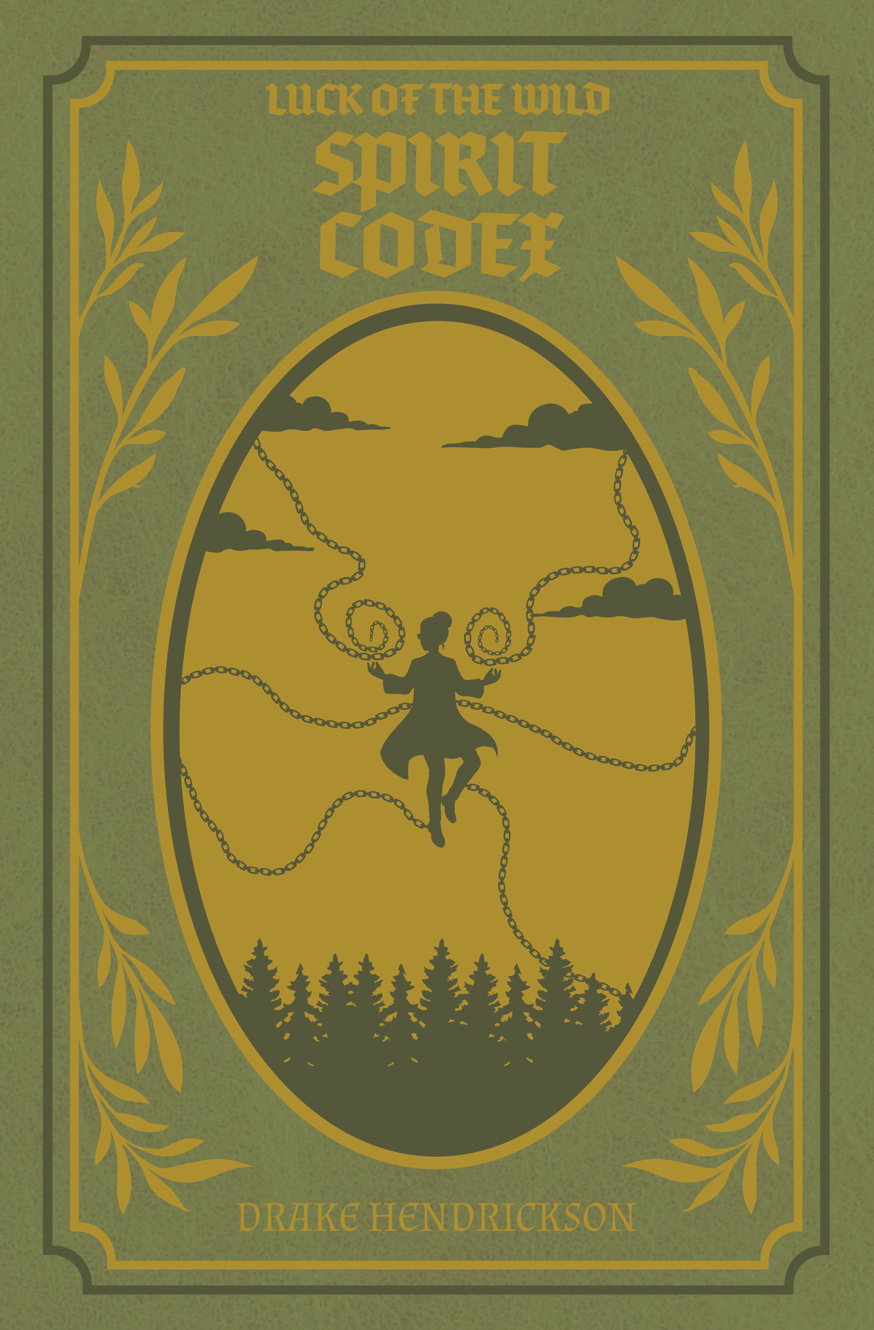
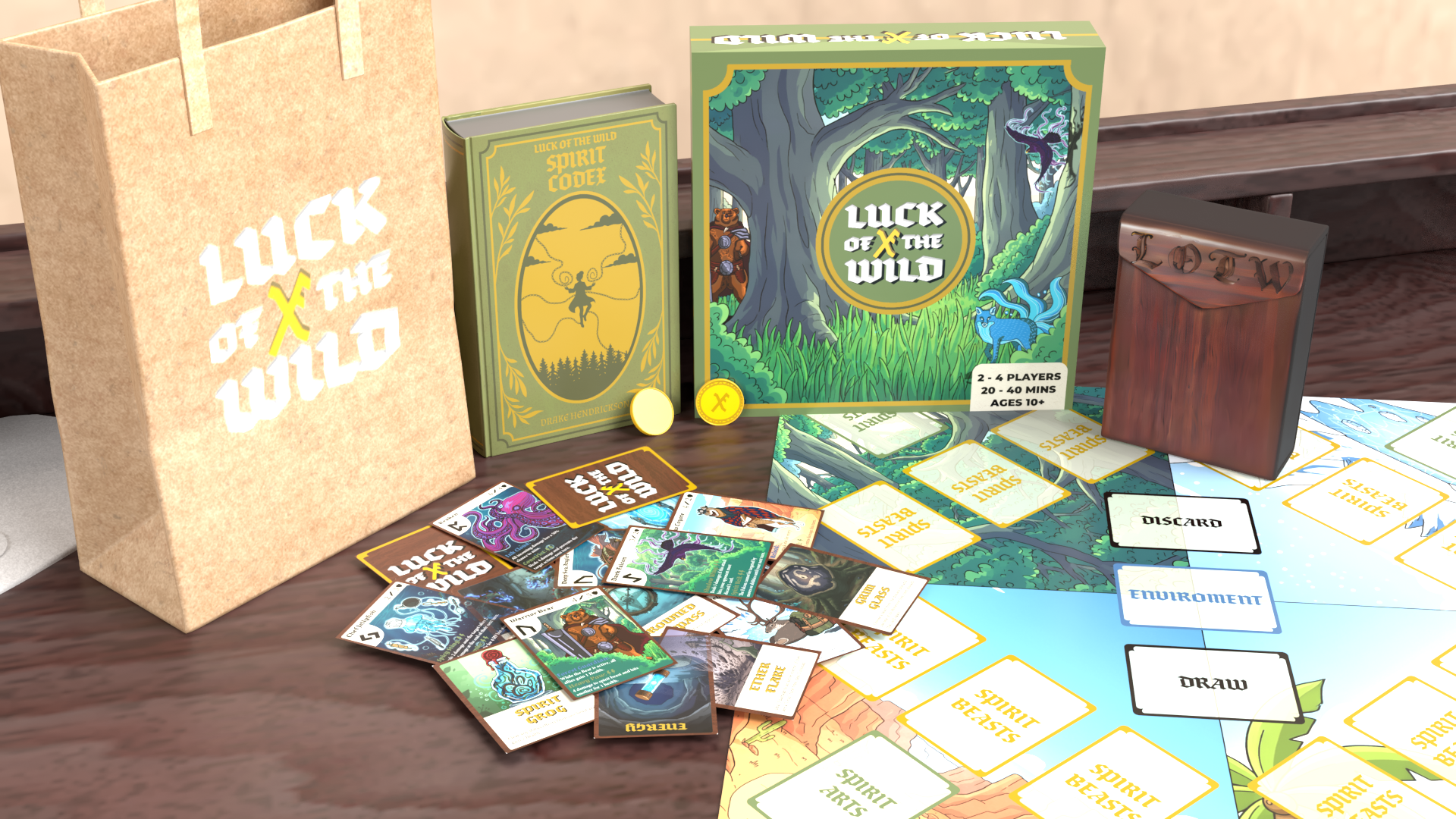
The Core Concept: Risk the Wild, Win the Legend
Luck of the Wild is a strategic tabletop experience where the unpredictable beauty of nature meets high-stakes tactical gameplay. In a world where every draw of a card can shift the ecosystem, players must navigate a landscape of legendary creatures, shifting terrains, and the fickle hand of fate itself.
The heart of the game lies in the balance between calculated strategy and raw luck. I designed this project to be a "full-stack" creative challenge: building a unique IP from the ground up that requires a cohesive visual identity across 2D illustrations, complex UI/UX card layouts, and 3D physical assets. Whether you’re outsmarting an opponent’s move or betting it all on a final roll, Luck of the Wild is about mastering the chaos of the natural world.
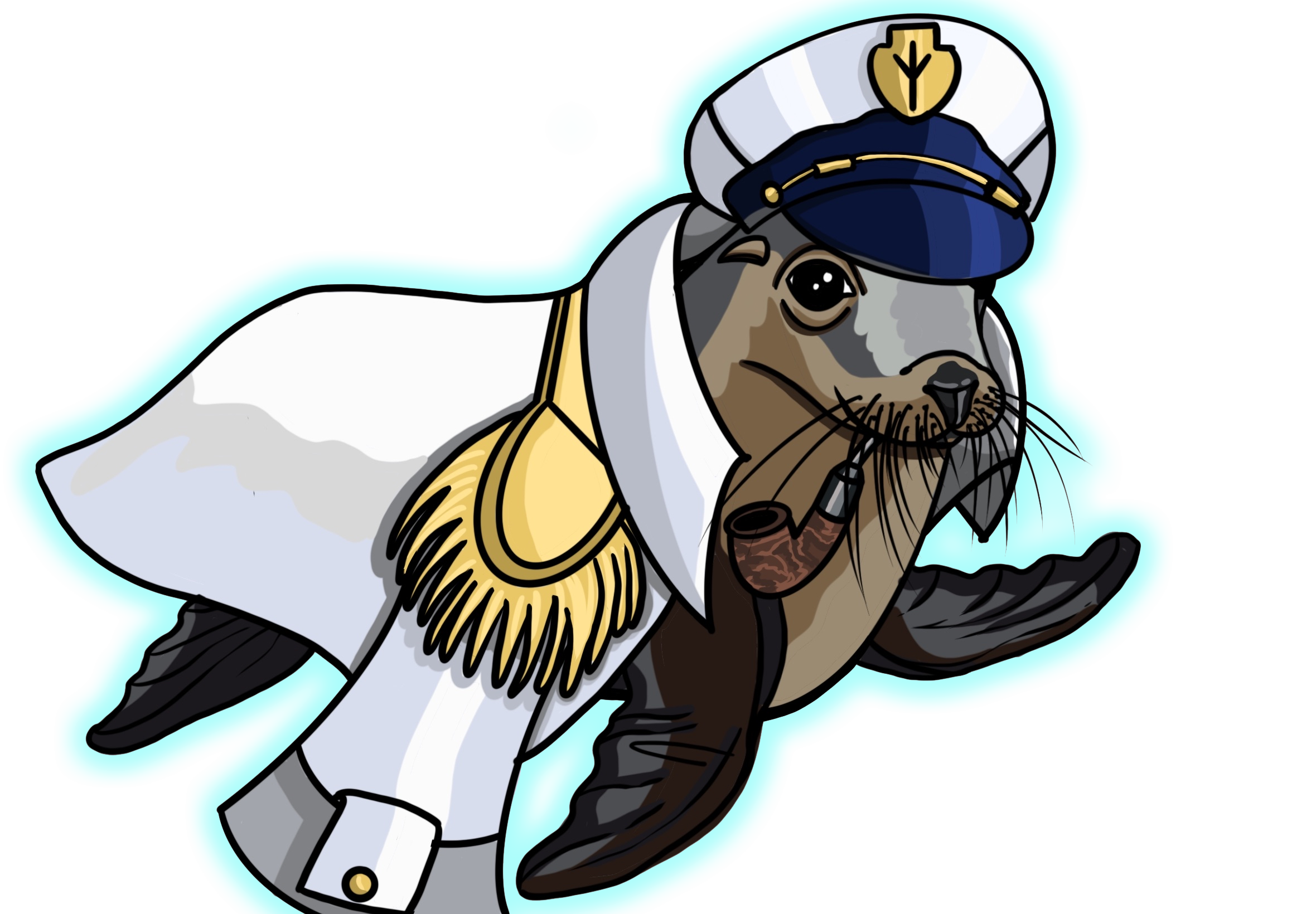
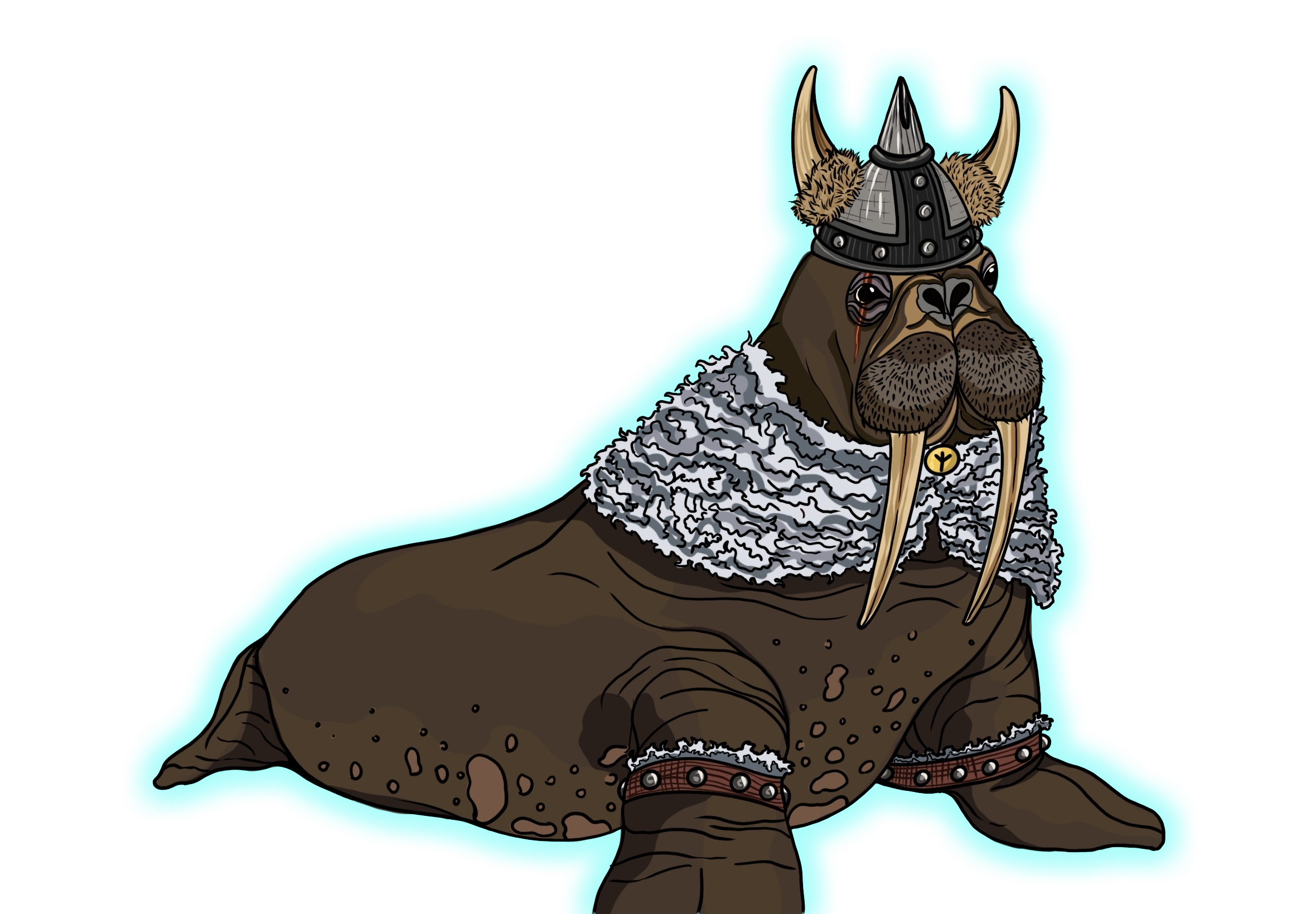
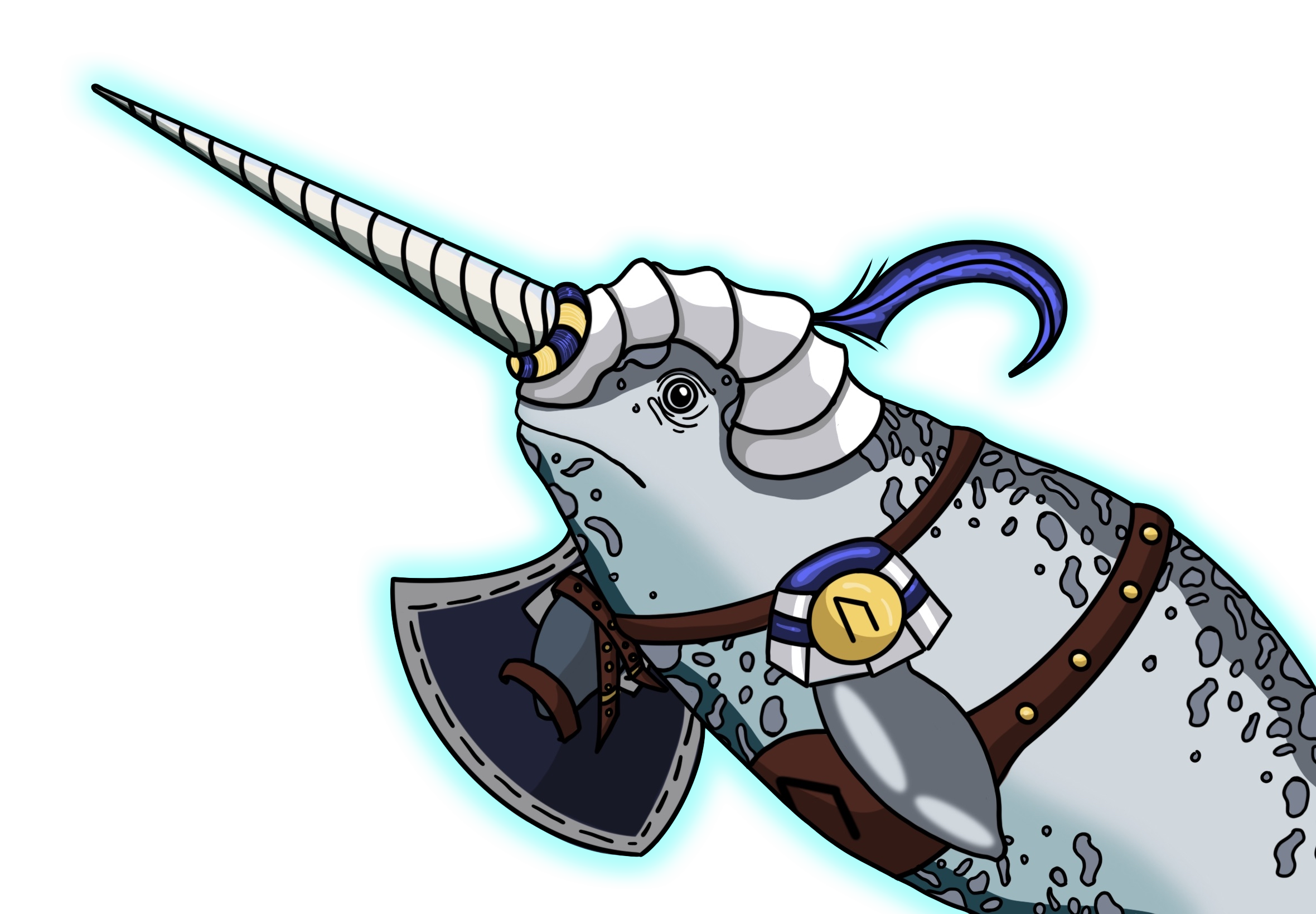
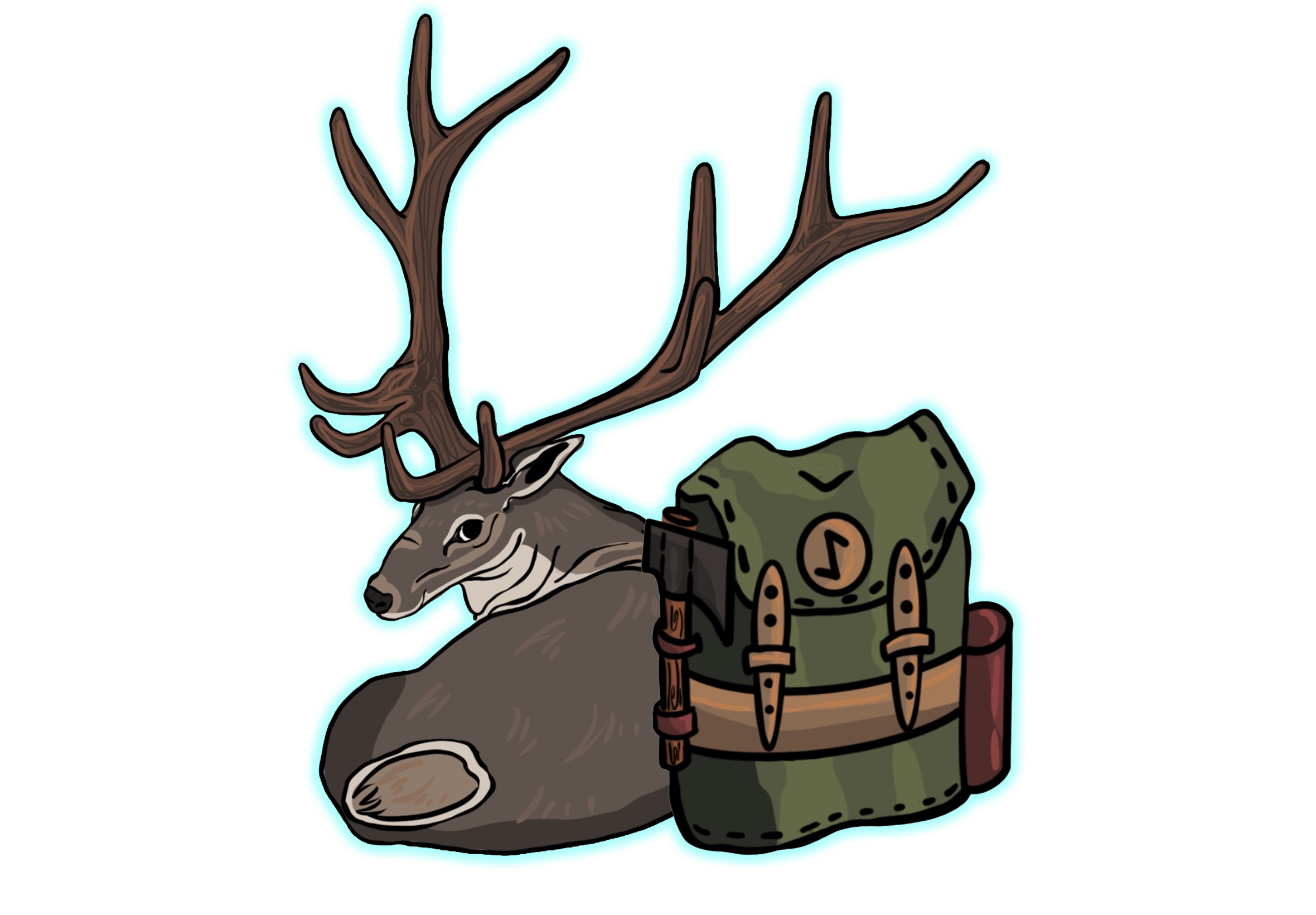
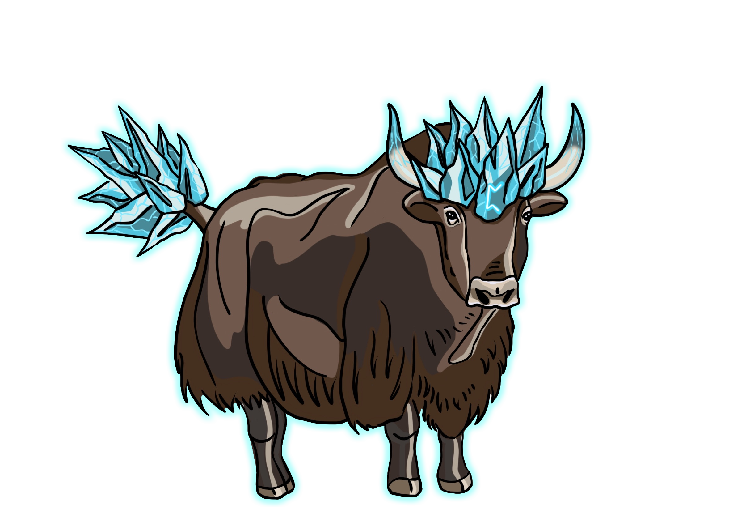
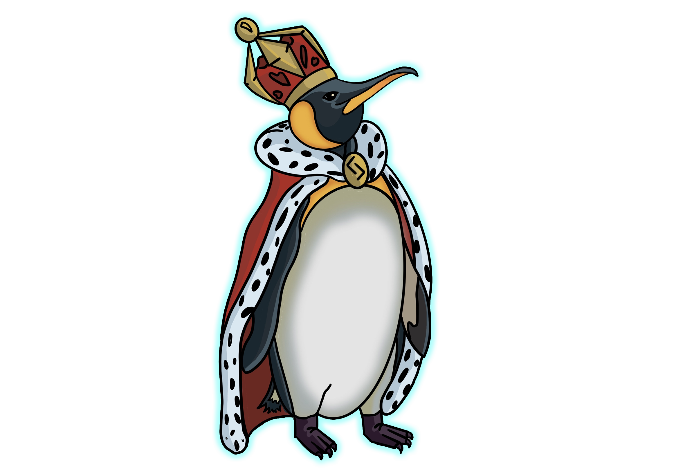
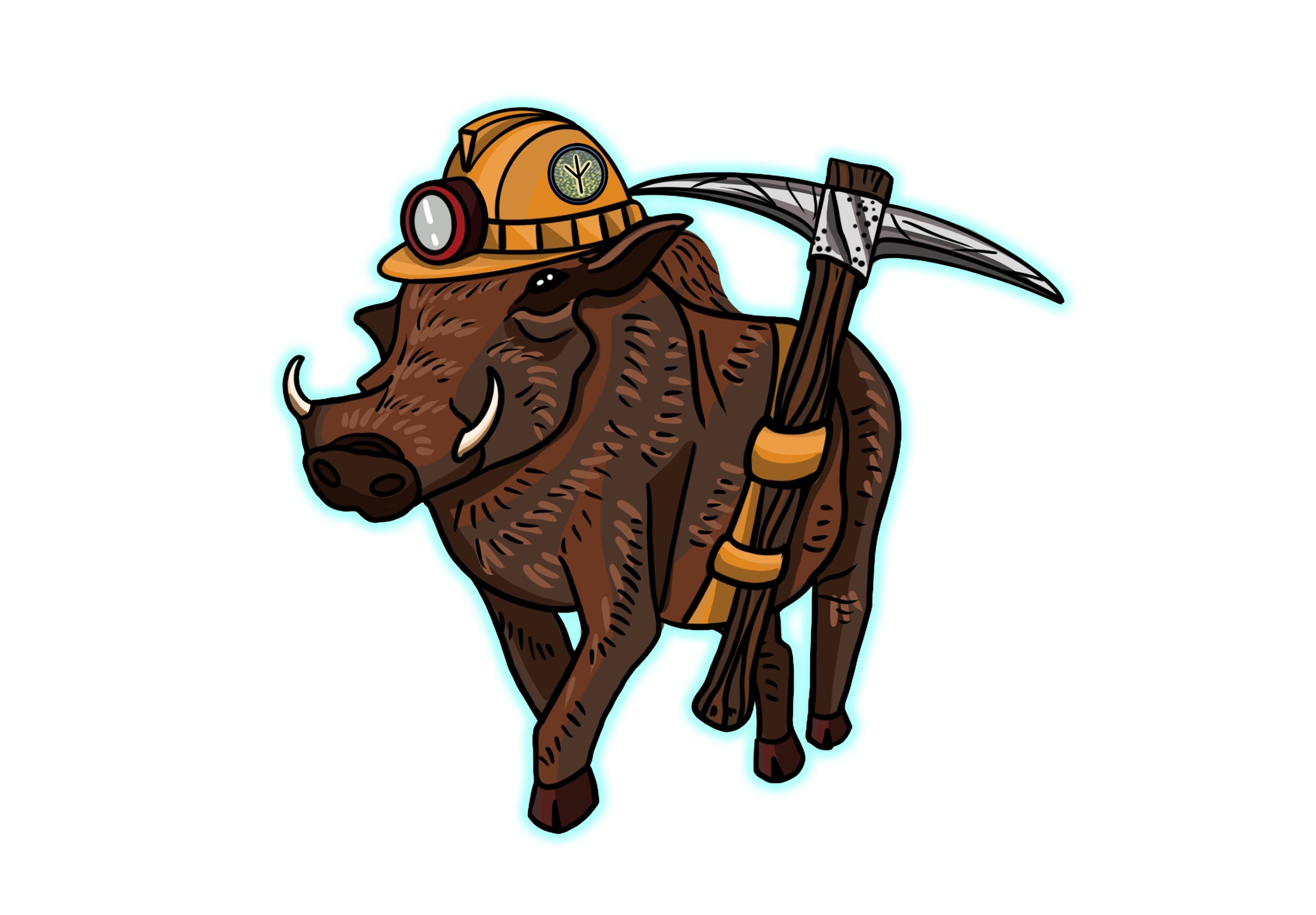
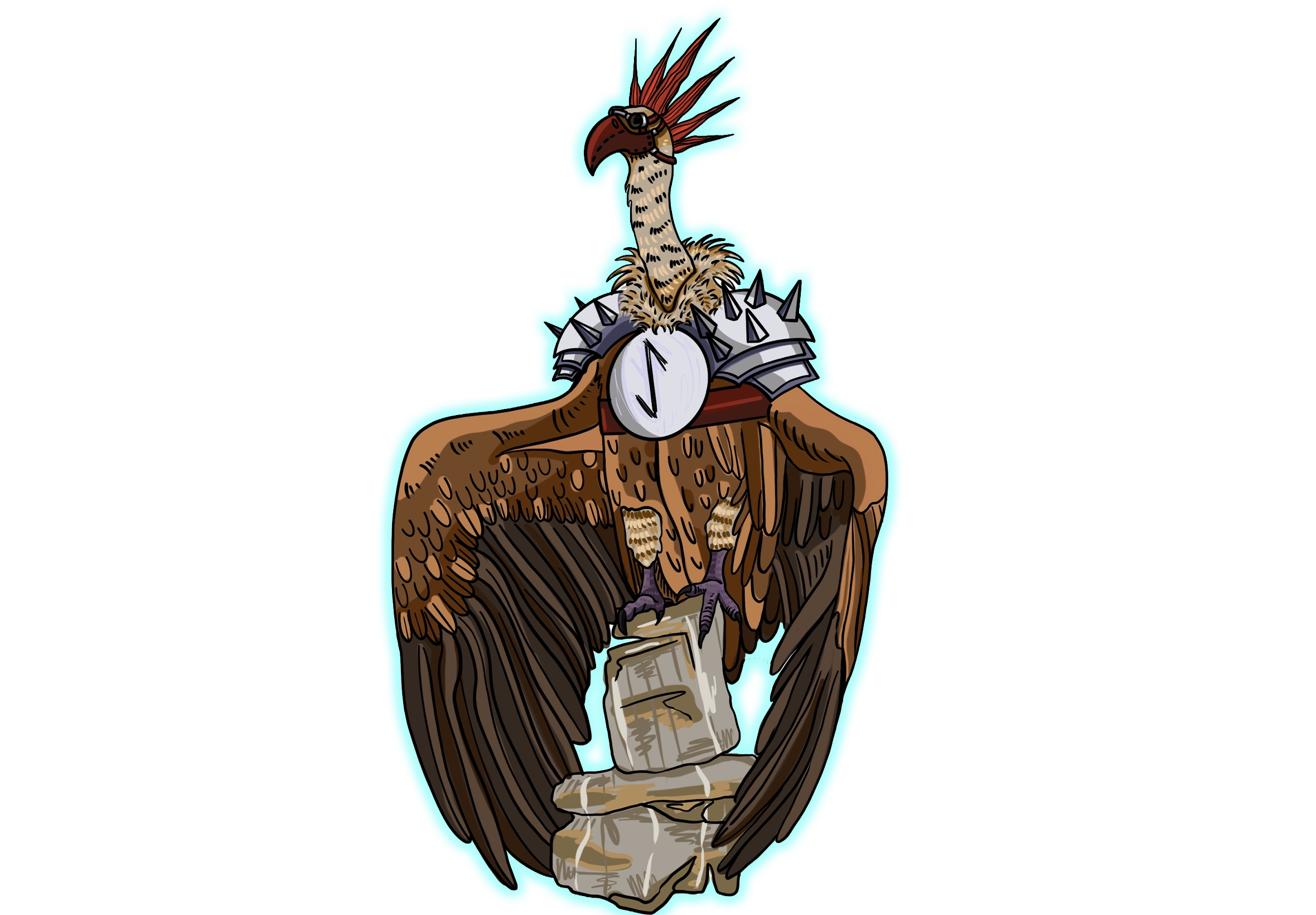
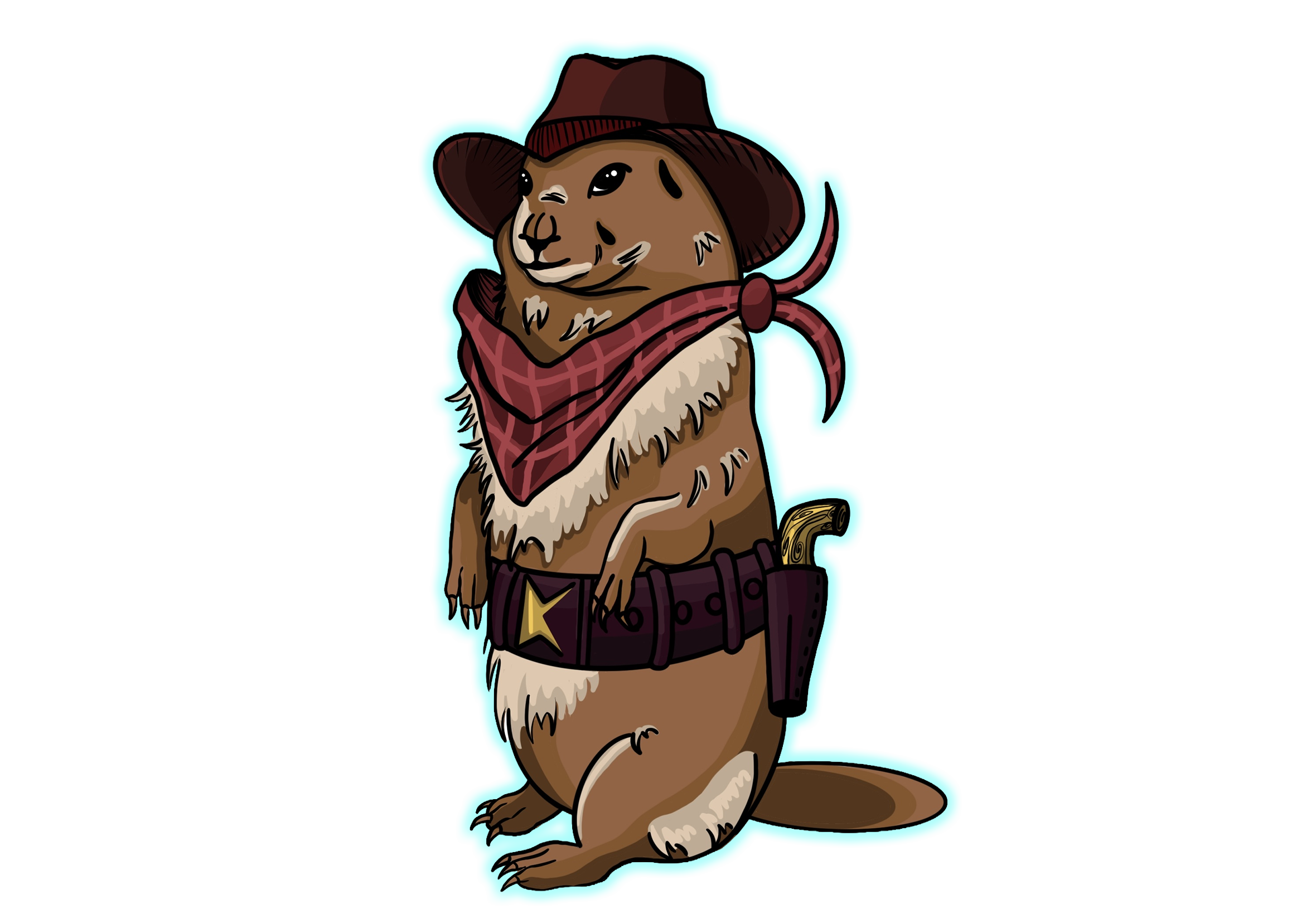
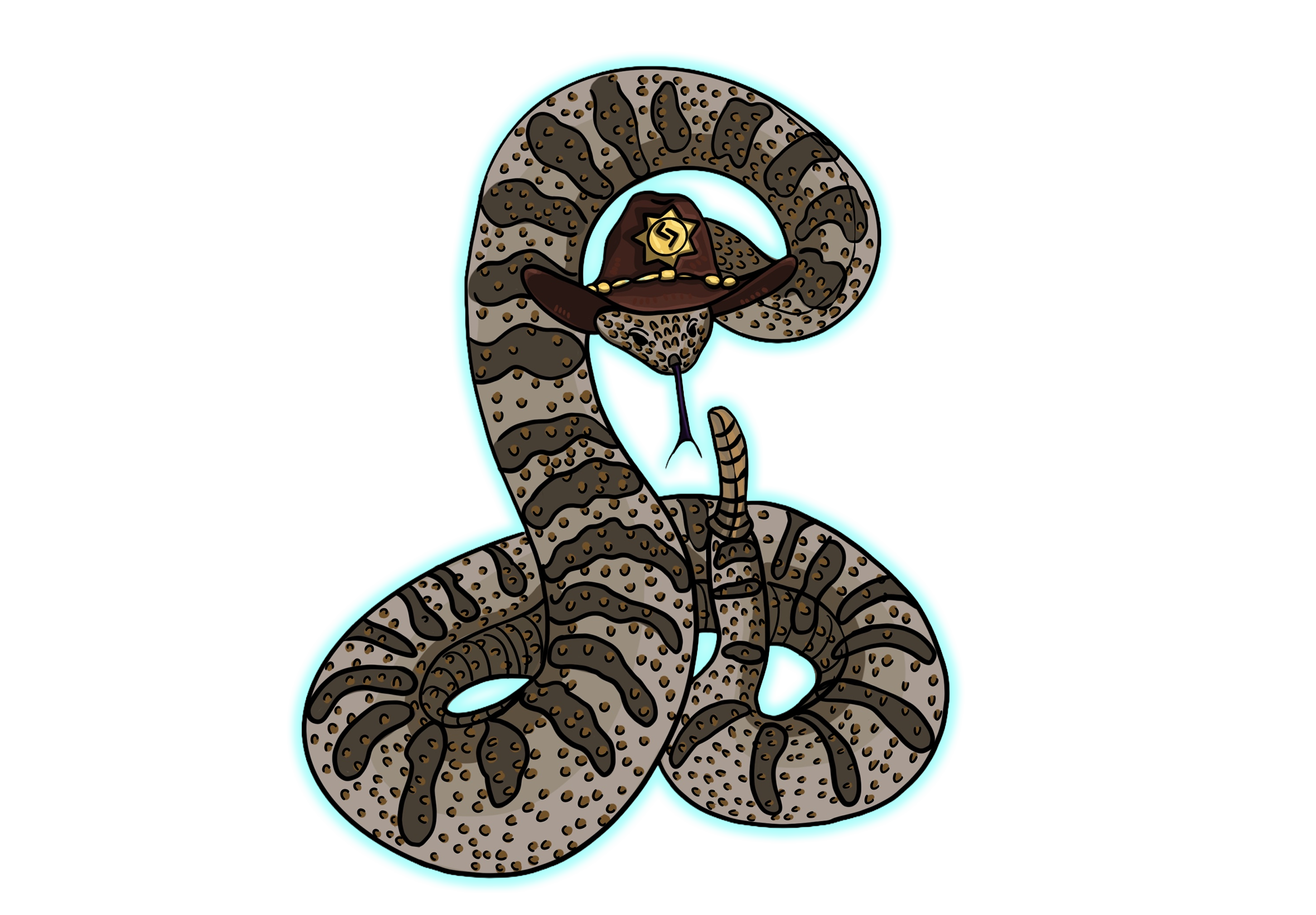
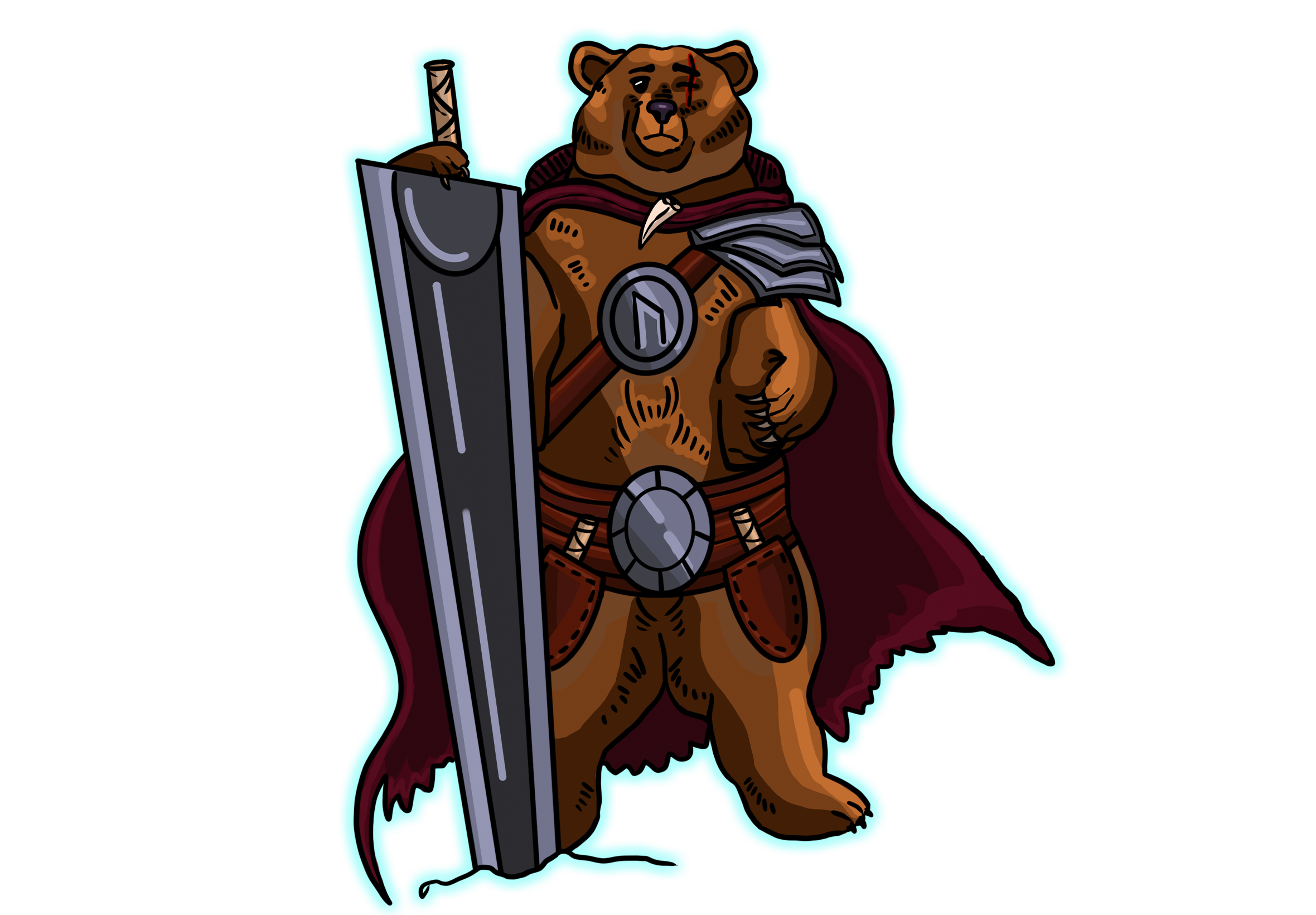
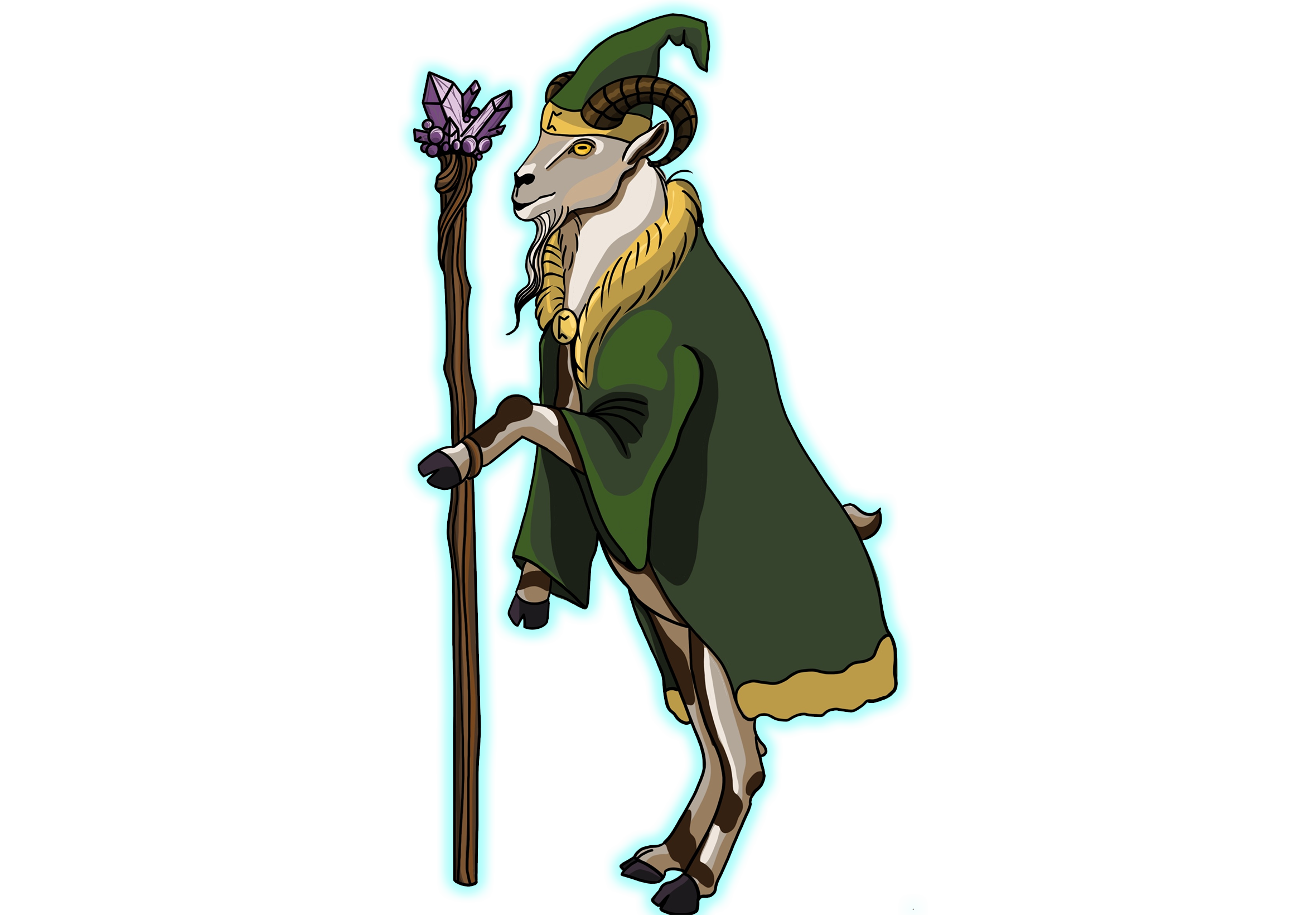
MEET THE CREATURES: CHARACTER ART
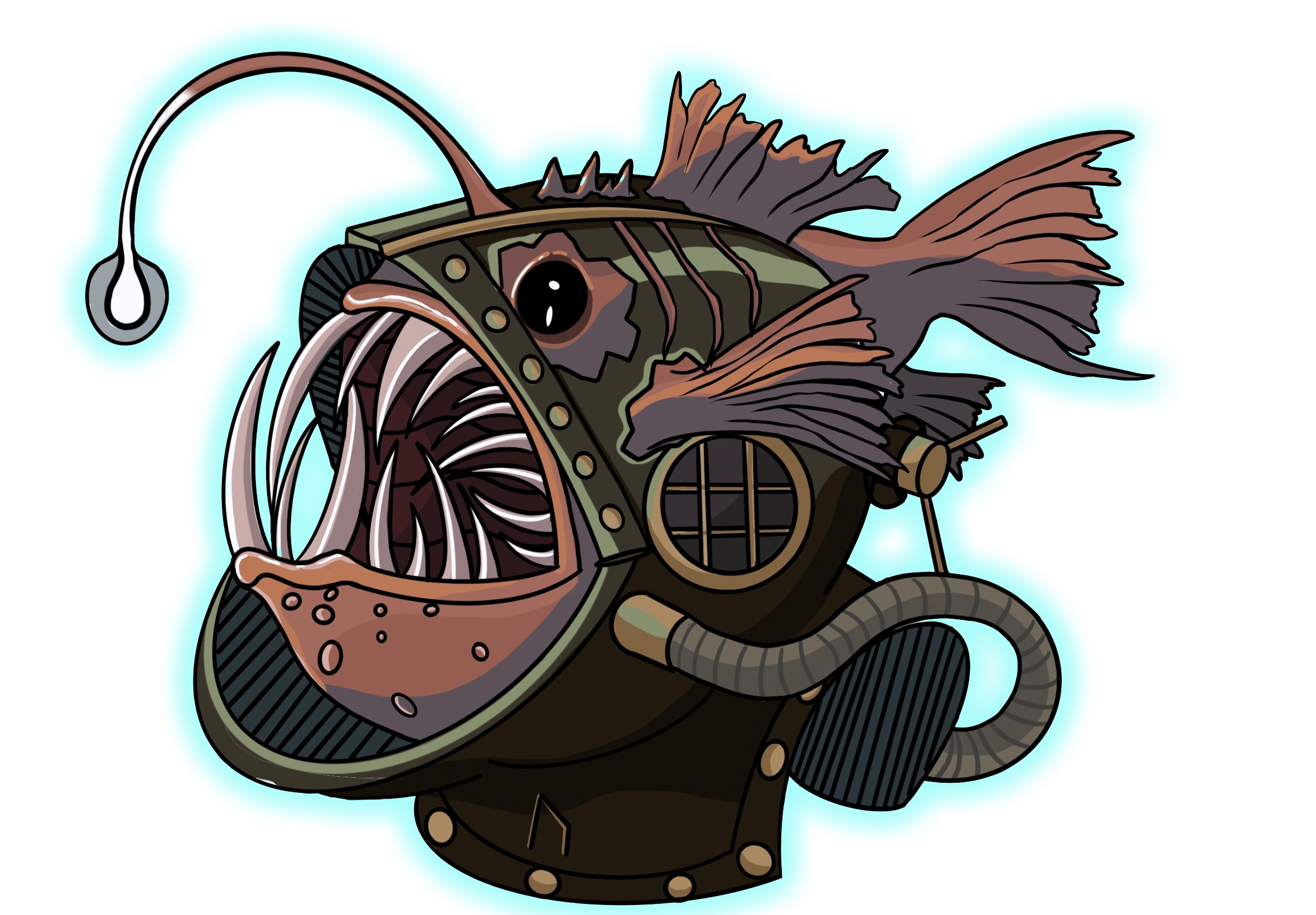
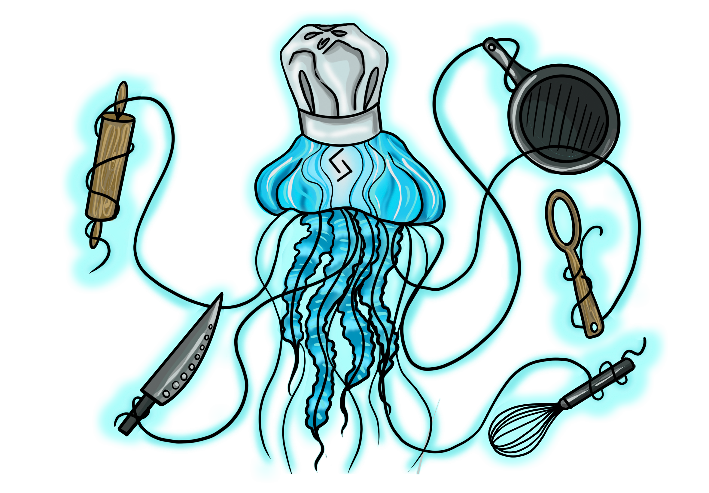
Building the world of Luck of the Wild started with a simple question: "What if the animals we know took on the roles of legendary RPG classes?" I spent weeks brainstorming personalities for each creature, ensuring their visual design told a story of their environment—from the Scuba-Angler in the deep trenches to the Wizard Goat on the highest peaks.
Every character was designed to feel like a living part of a shifting ecosystem, balancing whimsical charm with the tactical "edge" required for high-stakes gameplay.
ARTISTIC COLLABORATION:
Character Illustration: Daniella Alexander
View Her Portfolio →
BRINGING THE WILD TO LIFE: 3D ASSETS
Chef Jellyfish Spirit Beast
Warrior Bear
Sheriff Prairie Dog
Penguin King Spirit Beast
Deep Sea Angler
Deck Box
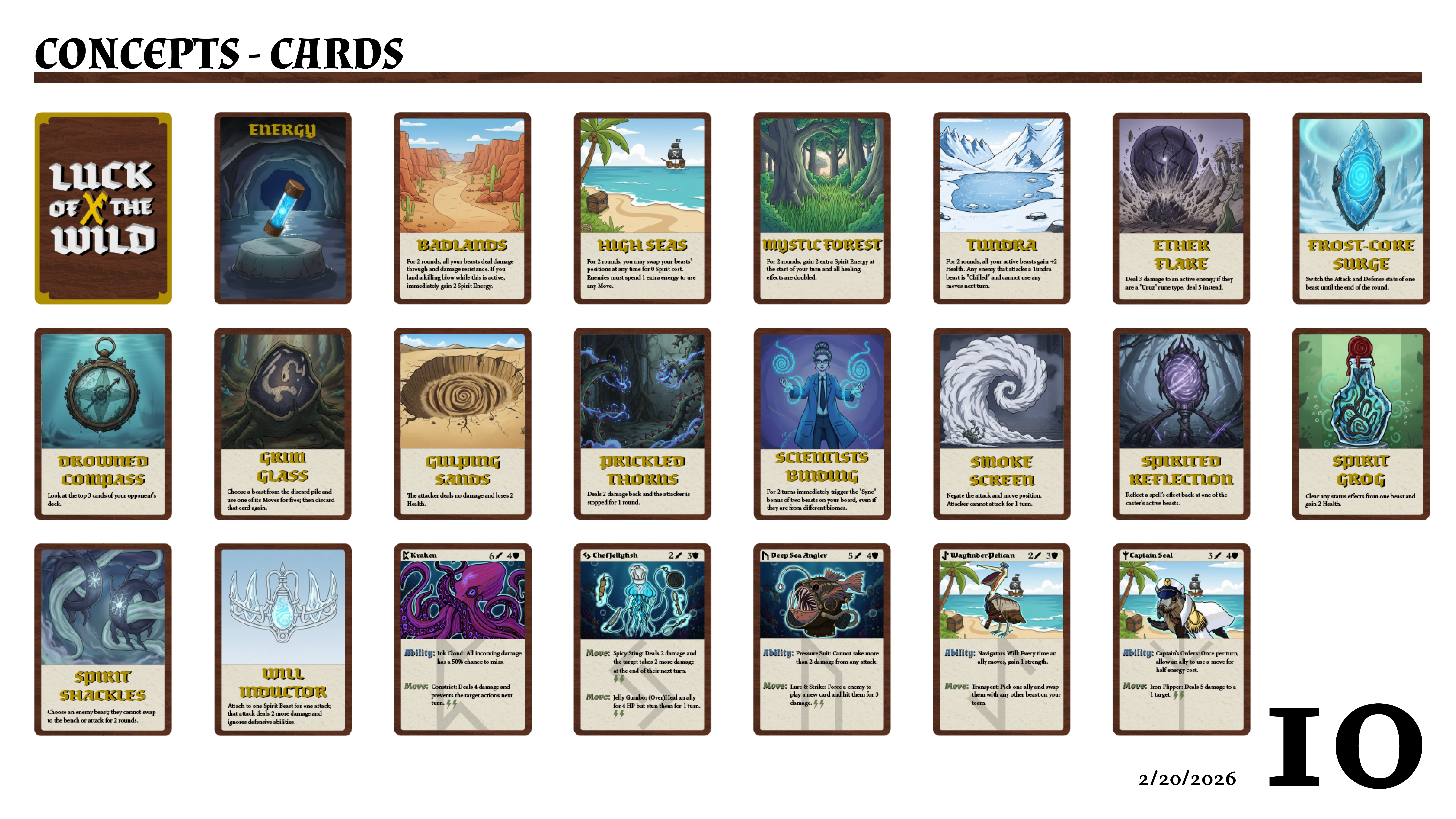
The Mechanic of Visuals: Card UI & UX Design
Designing the cards for Luck of the Wild was a balancing act between immersive fantasy art and cold, hard data. In a game driven by "push-your-luck" mechanics, the player needs to make split-second decisions without wrestling with the layout. I treated each card as a user interface, ensuring that the most vital information was always front and center.
I developed a modular design system that allows for massive variety while maintaining a consistent brand feel. My focus was on three key areas:
- Visual Hierarchy: Using bold color-coding and specific icon placement, I ensured that "Cost," "Ability Type," and "Power Level" are readable from across the table.
- Symbolism Over Text: To keep the game fast-paced, I replaced wordy descriptions with custom icons (keywords). This reduces "cognitive load" for the player and makes the game more accessible to new adventurers.
- Information "Fanning": I placed the most critical stats in the top-left corner. This is a deliberate UX choice, ensuring that when a player holds a fanned-out hand of cards, they can see exactly what they have at a glance.
Design Note: Every background texture and border was hand-crafted to match the "Wild" theme—incorporating organic shapes and weathered parchment textures to make the cards feel like artifacts found within the game world.
The Editorial Build: Layout & Storytelling
Research is one thing, but making a 100-page magazine feel like a cohesive journey is where the real work happens. In this phase, I acted as both the Art Director and the Production Lead, ensuring that every page turned felt like a natural progression of the PC Gamer story.
- Pacing the Narrative: I designed these spreads to guide the reader’s eye—using "Big-Small-Medium" image hierarchy to create visual rhythm.
- The "HendiKnight" Twist: I swapped out standard placeholder text for actual curated gaming content, ensuring the typography (like the drop caps and pull quotes) worked with real-world character counts and line breaks.
- Technical Polish: I managed the Master Pages, Style Sheets, and Baseline Grids to ensure that if I changed a font on page 5, the entire magazine stayed perfectly aligned.