THE DEEP DIVE: A PC GAMER DESIGN AUDIT
Before I moved a single pixel, I had to get under the hood of the iconic PC Gamer brand. I didn’t just want to mimic the style; I wanted to understand the "why" behind their layout. I treated this phase like a forensic investigation part design audit, part obsessed fan.
BREAKING DOWN THE DNA
I spent time analyzing both physical back-issues and digital editions to reverse-engineer their visual language. I documented every recurring element that makes a magazine feel like PC Gamer.
FRAME DETAILS
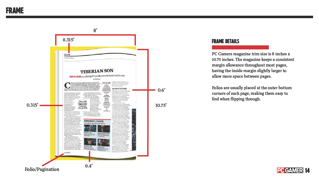
PC Gamers magazine trim size is 8 inches x 10.75 inches. The magazine keeps a consistent margin allowance throughout most pages.
FORMAT & TYPOGRAPHY
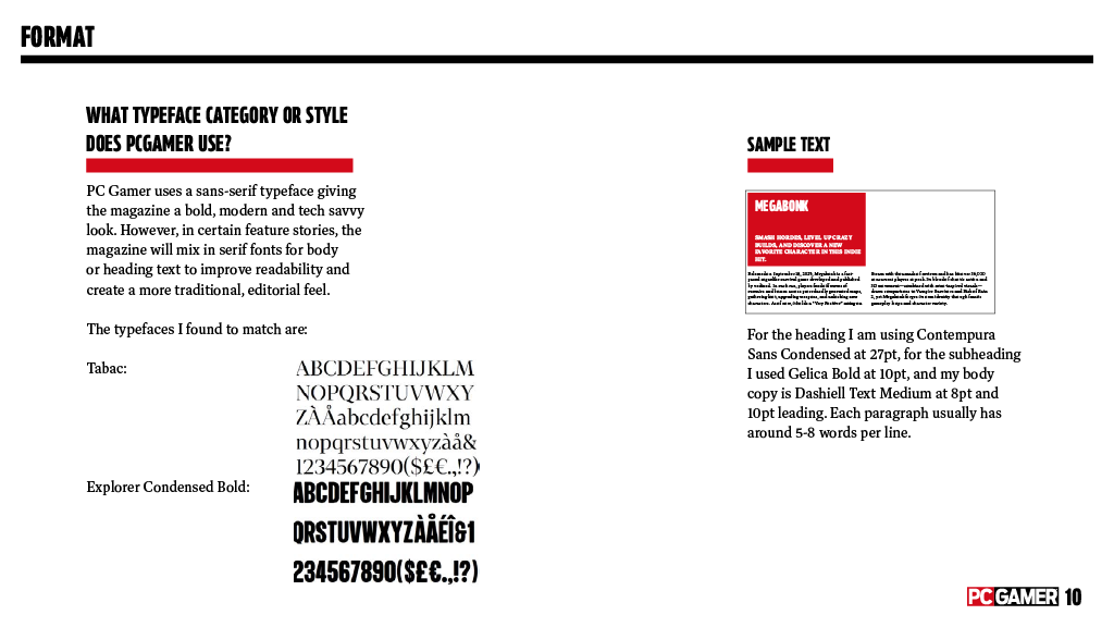
PC Gamer uses a bold, modern sans-serif typeface to maintain a tech-savvy look, while mixing in serif fonts for body copy to improve long-form readability.
TYPOGRAPHY & HIERARCHY
I identified their specific font pairings and precisely measured type sizes, leading, and tracking to ensure my headlines hit with impact.
BRAND PATTERNS & FUNCTION
I dissected the subtle textures and geometric patterns that define their cover designs, ensuring my work felt like an official extension of the brand.
VISUAL DNA
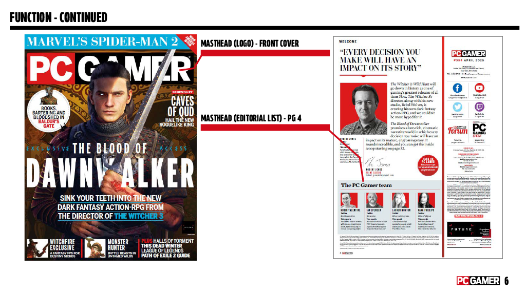
By mapping the masthead-to-subject relationship, I was able to replicate the professional "layered" look of high-end editorial design.
FROM BLUEPRINT TO BUILD: THE CREATIVE APPLICATION
Once the audit was complete, I moved from detective to designer. My goal wasn’t just to make a magazine that looked like PC Gamer, but one that functioned like a professional publication. I applied everything from my research, the exact column grid structures, baseline, and typography hierarchies, to create spreads that feel like they belonged in a newsstands today.
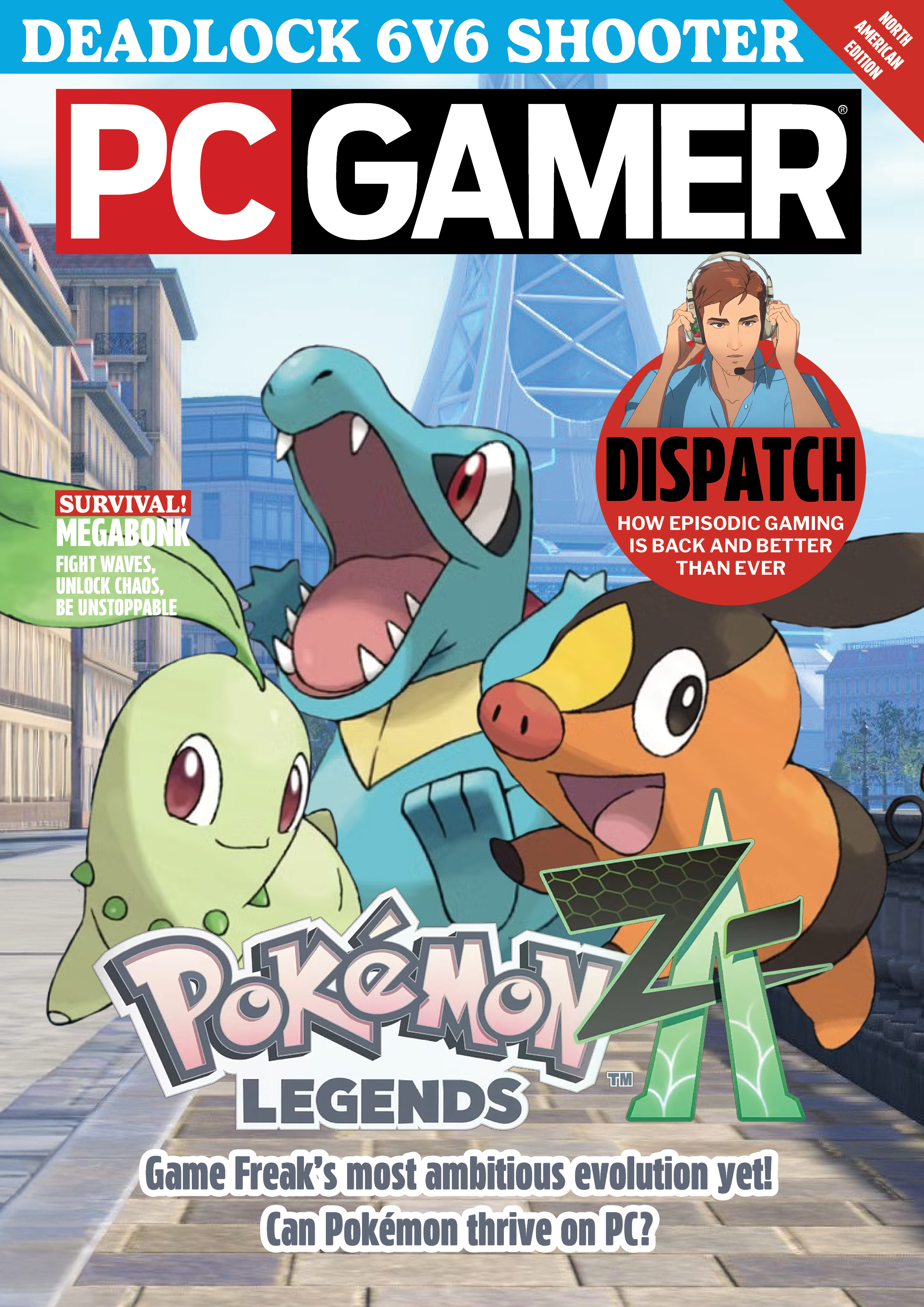
Using Adobe InDesign and Photoshop as my main hubs, I built out the "Pokémon Legends: Z-A" cover feature. I focused on several key areas to ensure the highest level of professional polish:
- Custom Cover & Editorial Spreads: I designed a high-impact cover that utilized the "masthead-behind-subject" technique, creating depth between the PC Gamer logo and the featured Pokémon.
- Typography & Technical Specs: I implemented the specific font families identified in my audit, paying close attention to kerning, leading, and tracking to maintain production standards.
- Advertising & Brand Integration: I designed custom advertisements, such as the Logitech "No Limits" G305 ad, ensuring the branding was indistinguishable from real-world materials.
- Interactive Digital Edition: To bridge the gap between print and digital, I produced an interactive PDF version to showcase how the static design translates to a digital space.
Link: https://indd.adobe.com/view/858b881c-a243-42ed-9bde-2b63a2cee65f