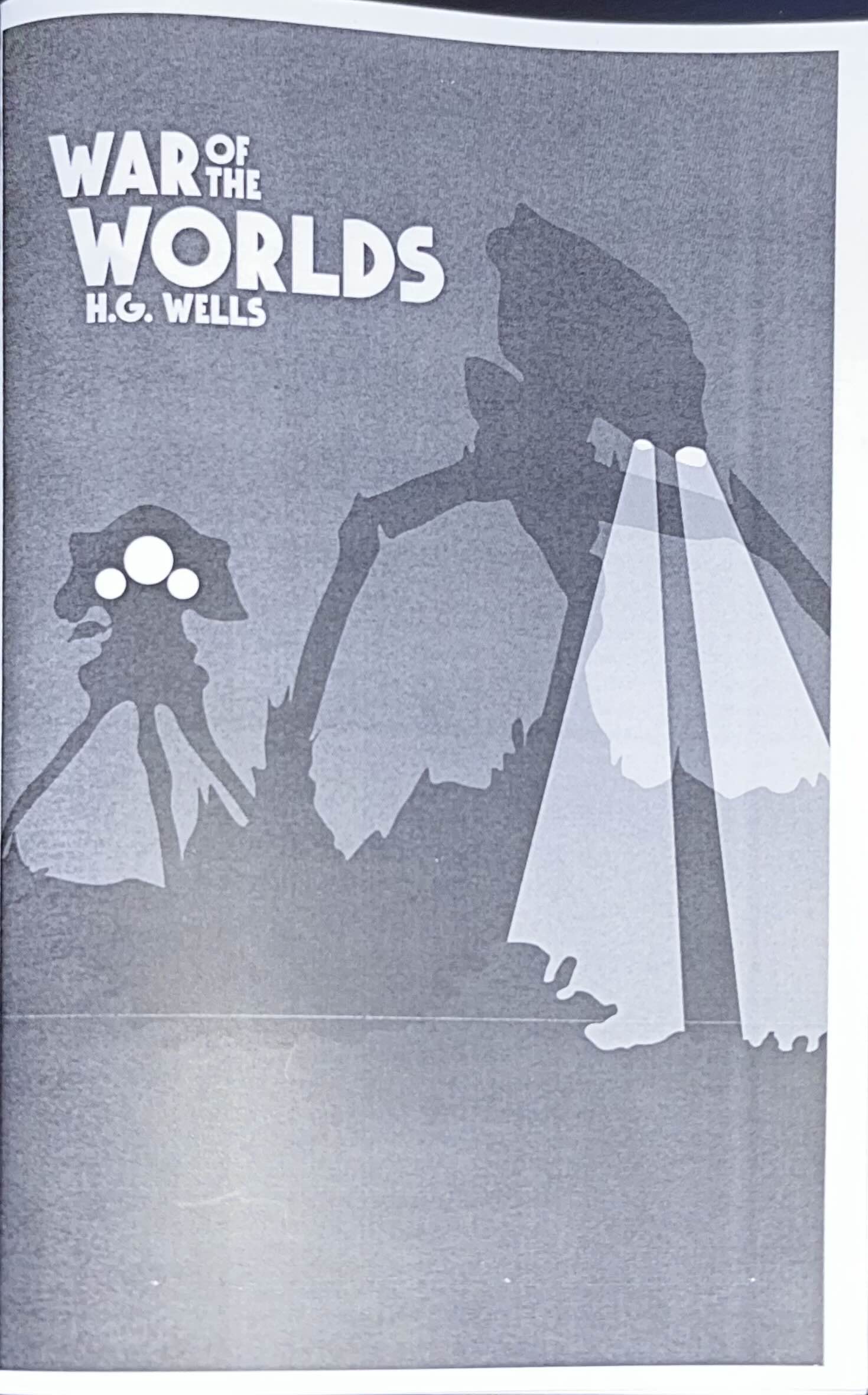
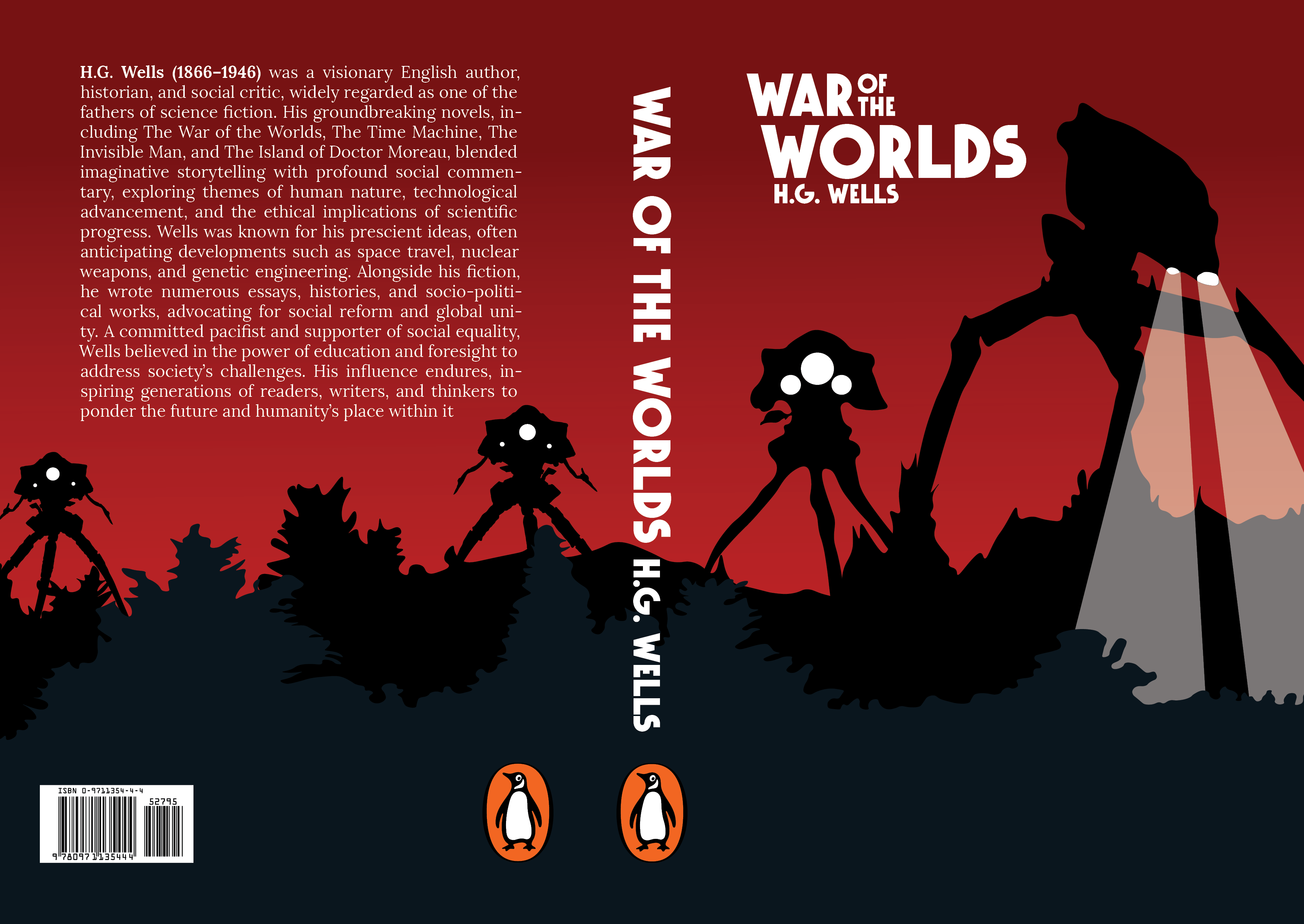
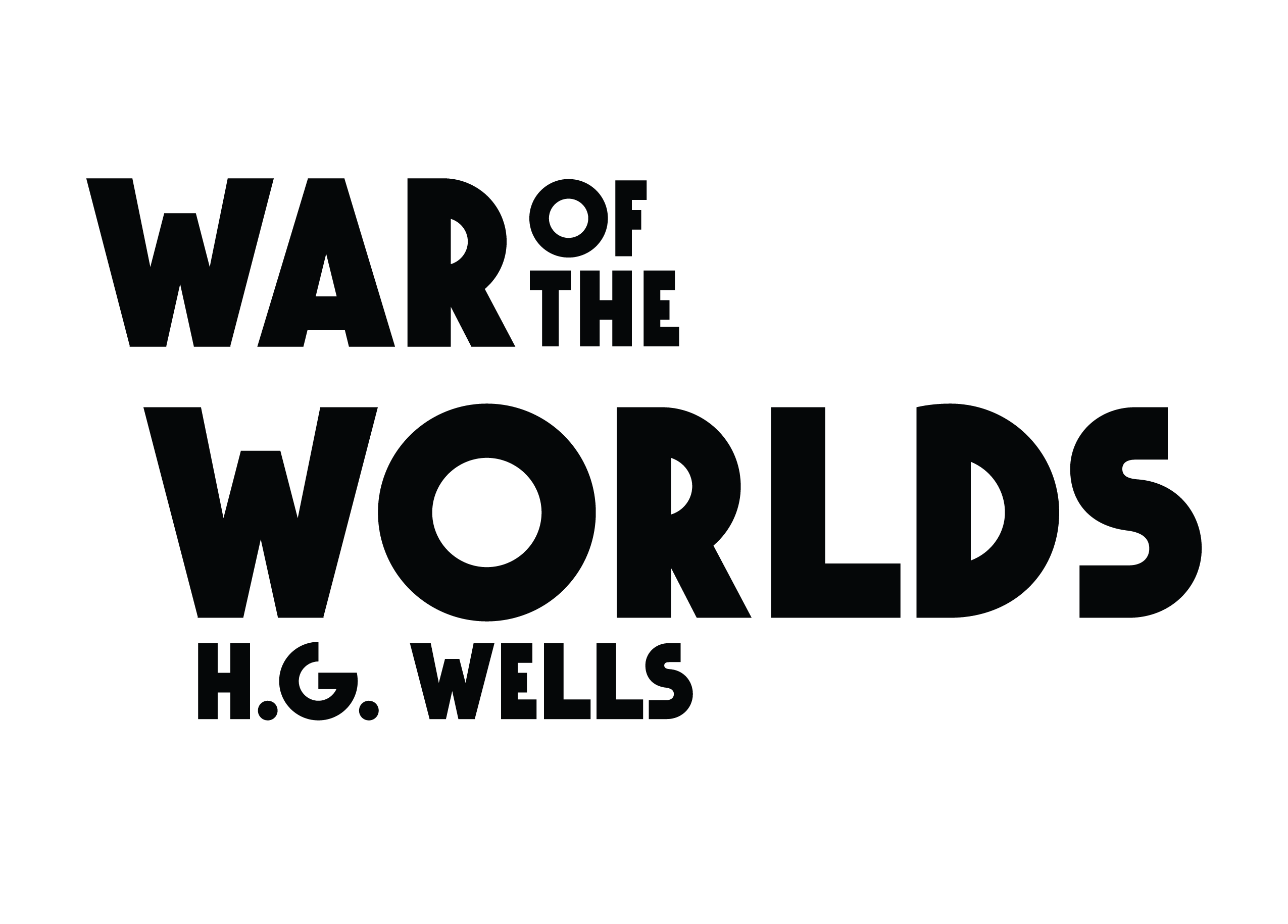
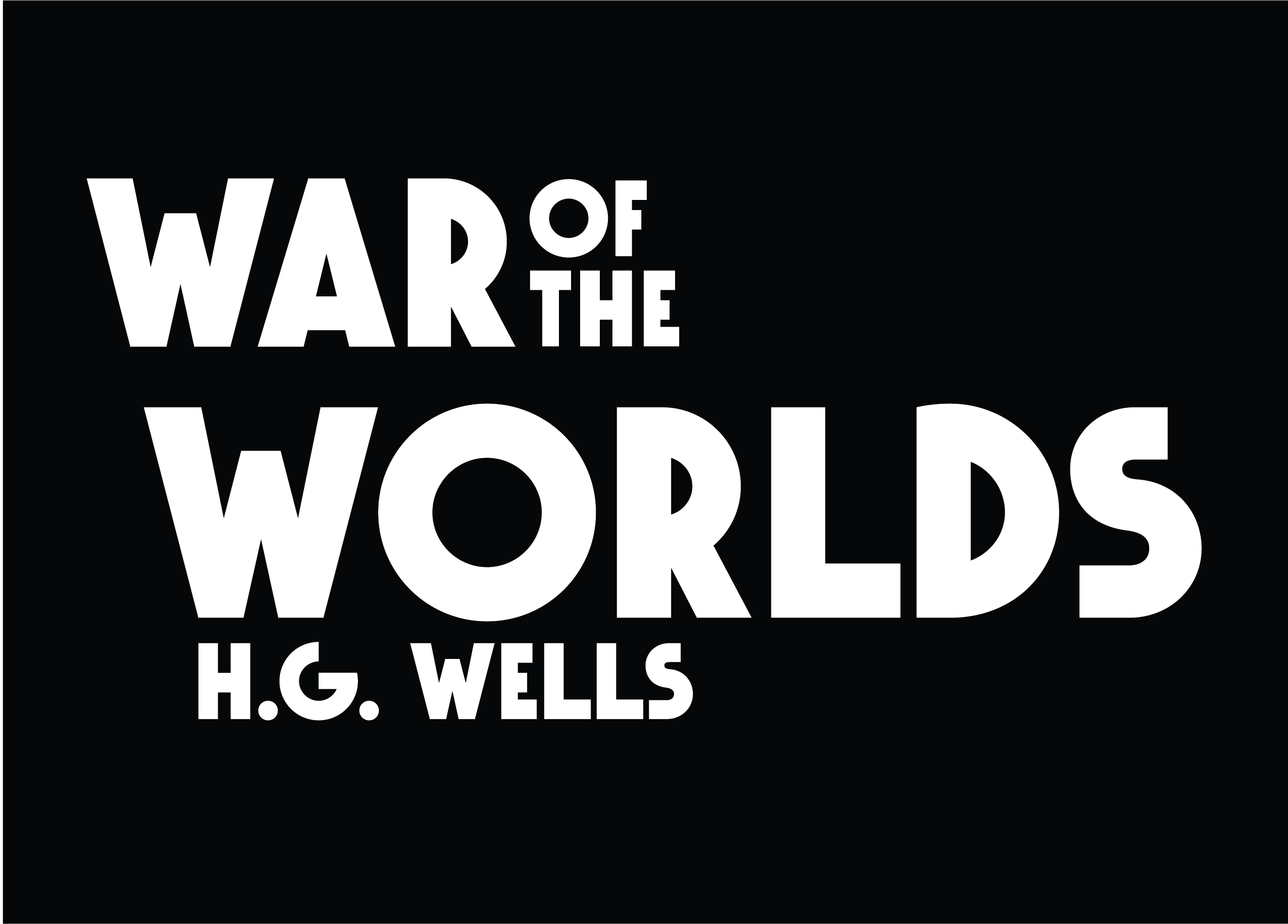
ANATOMY OF AN INVASION: CUSTOM TYPOGRAPHY
Designing the title for War of the Worlds required a typeface that felt like a bridge between Victorian elegance
and extraterrestrial machinery. I developed a custom type treatment that focuses on high-contrast weighting and
sharp, mechanical serifs. The goal was to create a logo that felt "heavy," as if the letters themselves were
constructed from the same cold iron as the Martian Tripods.
By manually adjusting the kerning and adding subtle, distressed textures to the edges, I ensured the title
didn't just sit on the cover—it anchored the entire visual composition. This phase was a study in architectural
balance, mapping out each glyph on a strict grid to maintain the structural integrity required for a premium
book spine and cover.
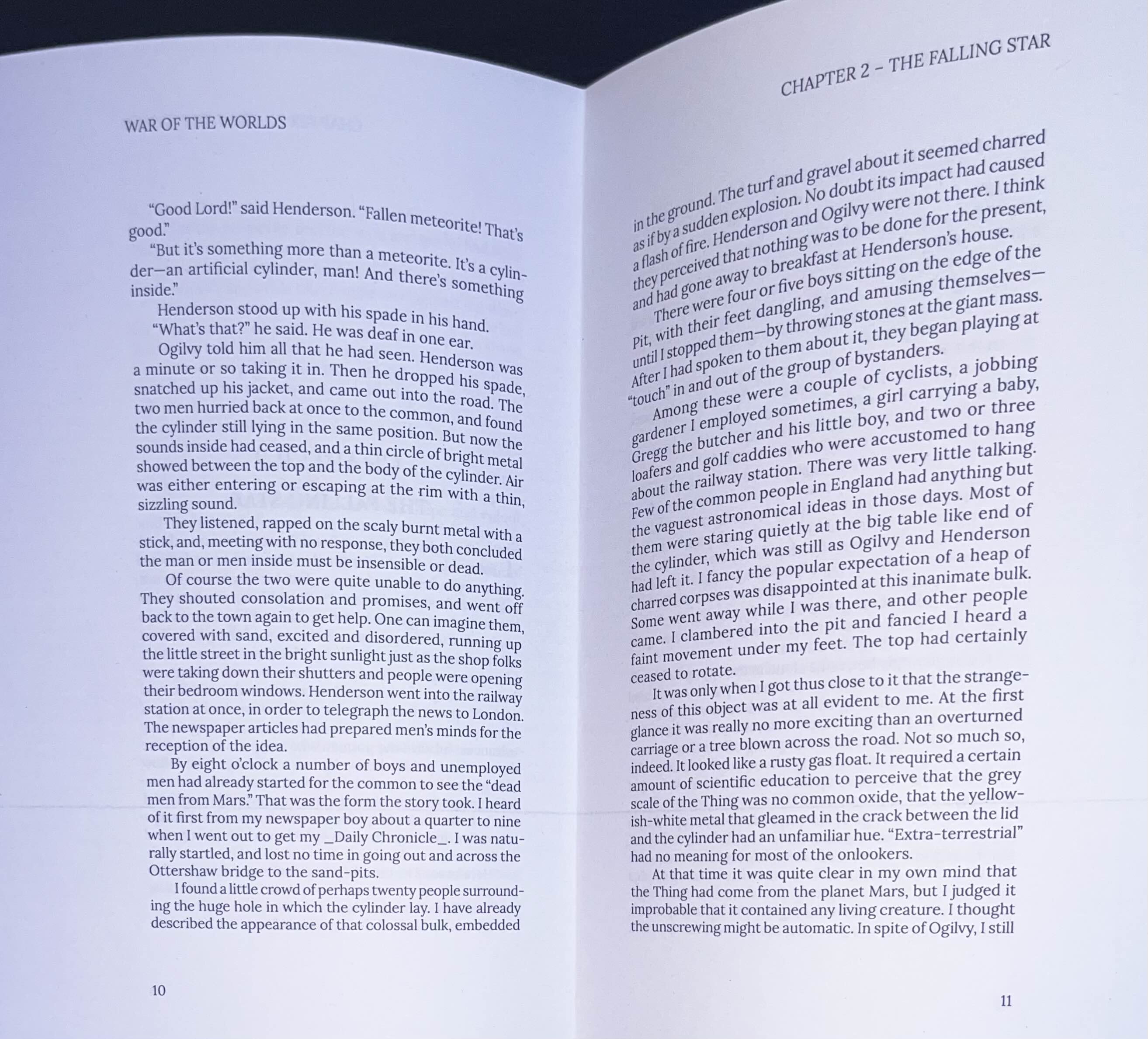
BEYOND THE COVER: EDITORIAL SYSTEMS
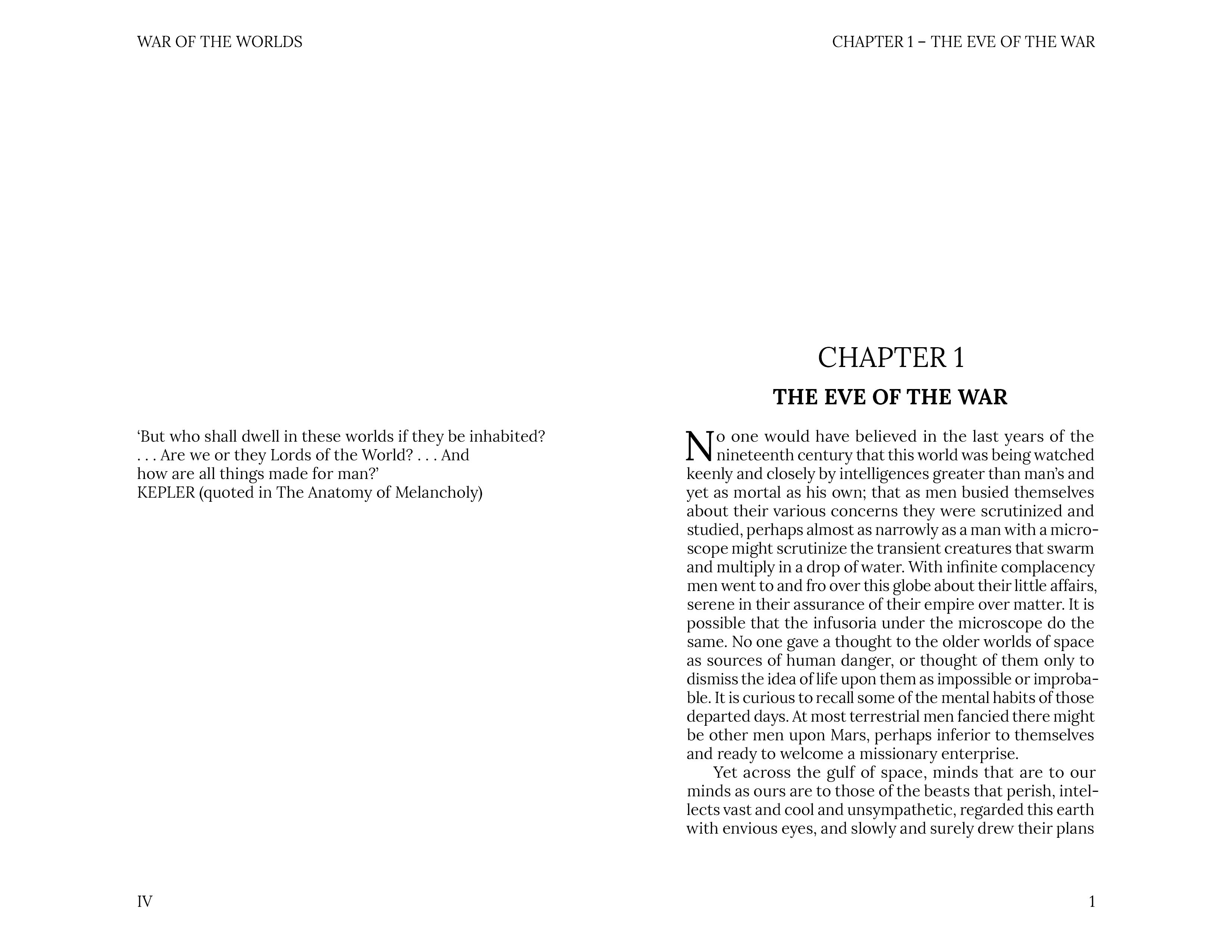
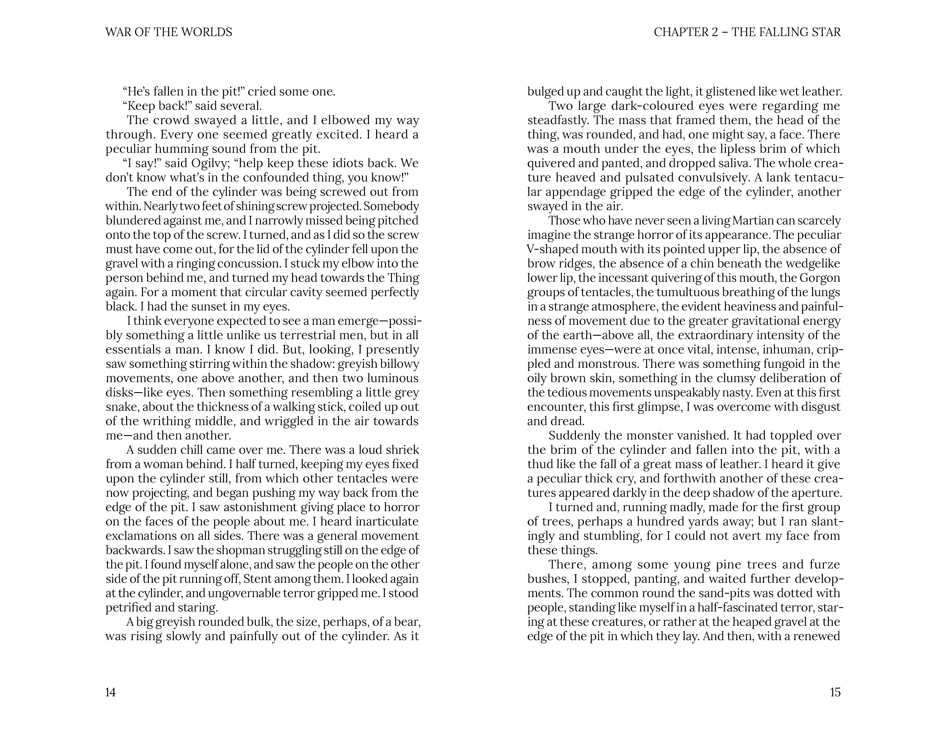
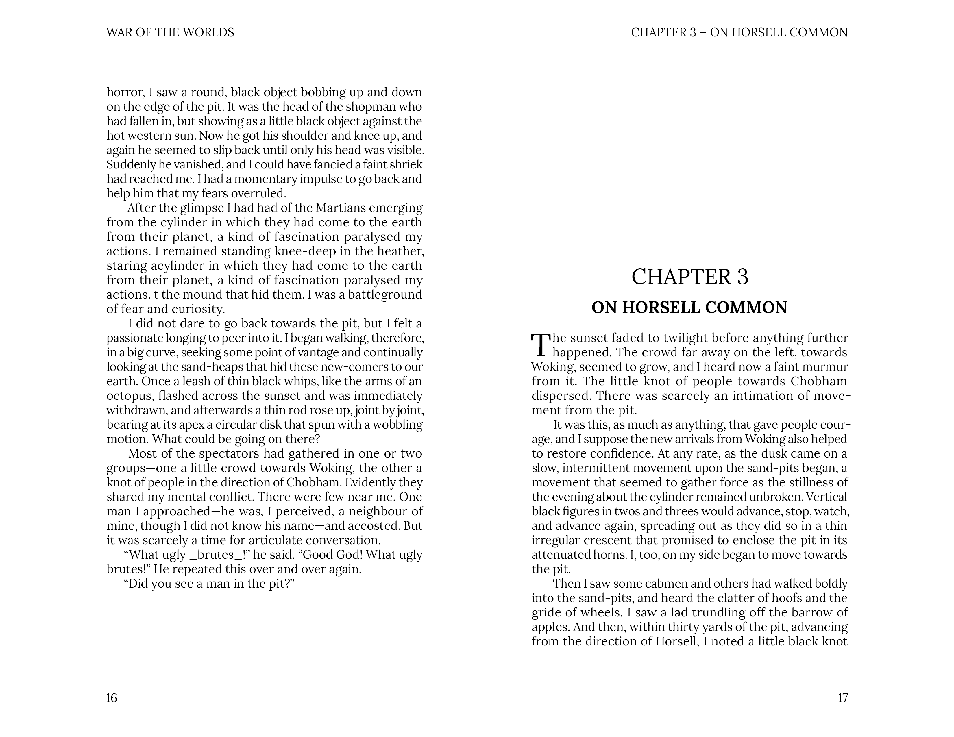
The interior layout was designed to feel like a found document—a firsthand account of the Martian invasion. To achieve this, I implemented a strict multi-column grid that balances dense narrative text with dramatic white space. I focused on the "Masthead-to-Subject" relationship, ensuring that chapter headers and section breaks utilize the same high-contrast, mechanical typography found on the cover to maintain a cohesive visual DNA throughout the book.
BEYOND THE COVER: EDITORIAL SYSTEMS
I paid particular attention to the typographic rhythm, using oversized drop caps and justified body copy to ground the reader in a traditional Victorian aesthetic. By layering the text against high-contrast, atmospheric imagery, I was able to replicate the professional look of high-end editorial design while keeping the focus on the escalating tension of the story.
SYSTEMATIC LAYOUT
I mapped out the interior pages using a baseline grid to ensure perfect horizontal alignment across every spread. This technical discipline allows the more experimental elements like the "shattered" type or overlapping imagery to feel intentional rather than chaotic.
FROM SCREEN TO SHELF: THE FINAL EDITION
The final phase of this project was the transition into physical production. My goal was to ensure that the heavy, mechanical energy of the digital typeface translated perfectly into a high-fidelity print. The final cover utilizes a high-contrast, deep-ink finish to give the black-and-white composition a "noir" intensity, making the custom title font appear as if it were stamped into the paper itself.
By printing a "real-life" physical version of the book, I was able to verify the editorial systems I developed for the interior—ensuring that the multi-column grids and high-contrast imagery maintained their professional polish in a handheld format. This final mockup serves as a proof of concept, demonstrating that the visual DNA of the Martian invasion is just as impactful on a bookshelf as it is on a screen.
PRINT SPECIFICATIONS
I selected a heavyweight matte cardstock for the cover to provide a premium, tactile feel that complements the "found document" aesthetic. The interior pages were printed on a slightly off-white, textured paper to soften the high-contrast typography and evoke a subtle sense of historical Victorian industrialism.