FROM INK TO ICON: CUSTOM TYPOGRAPHY & CONSTRUCT
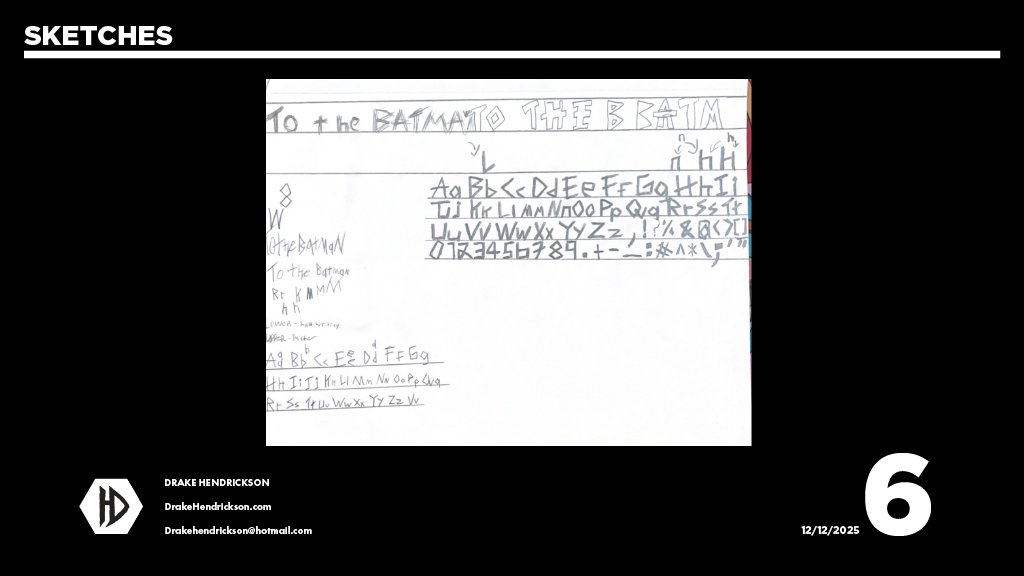
Every iconic poster starts with a single stroke. For this project, I didn't want to rely on pre-made fonts; I
wanted the title to feel as heavy and jagged as Gotham City itself. I began with a series of analog sketches,
exploring how sharp serifs and aggressive weighting could communicate the Dark Knight’s intensity.
This phase was about more than just "drawing a title." It was a study in architectural balance. I mapped out the
letterforms on a strict grid to ensure that even with their custom, weathered edges, the typography maintained
the structural integrity required for a large-format theatrical poster.
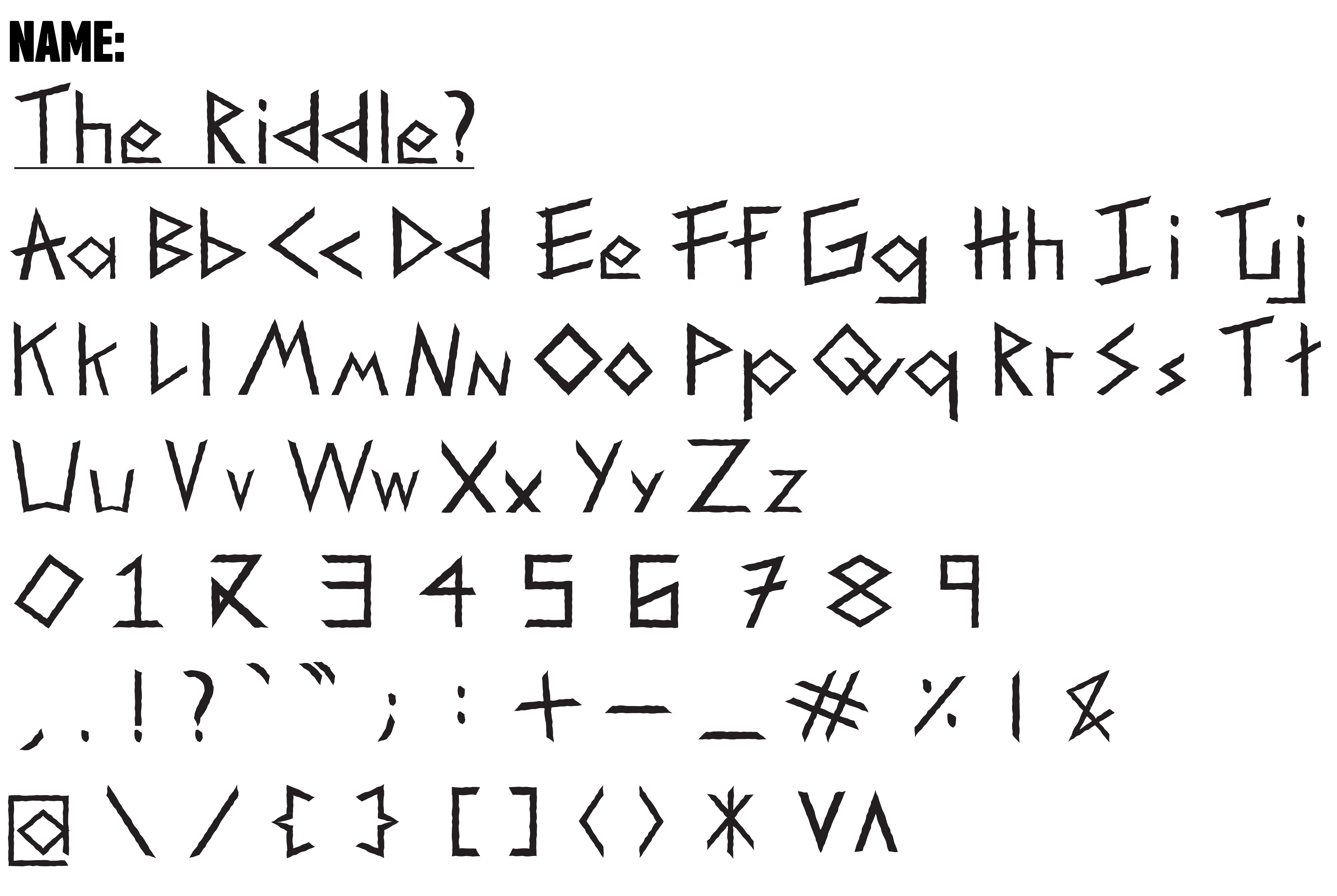
BREAKING DOWN THE DNA
After my initial sketches, I developed "The Riddle?" a custom display typeface. The goal was to create a set
of letterforms that felt less like an extension of the riddlers character.
Every character was built with a focus on aggressive angles, by stripping away standard curves and replacing
them with jagged edges, I ensured the typeface mirrored the fractured psyche of Gotham’s underworld.
GLYPH ARCHITECTURE
I expanded the set to include a full range of numerals and symbols, maintaining the "hand-carved" aesthetic throughout. The consistent use of sharp points and open terminals creates a feeling of unease, reinforcing it's cryptic nature.
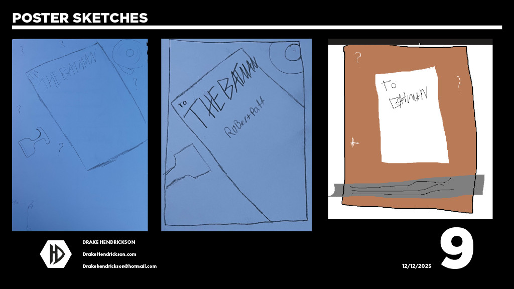
FROM THE SCREEN TO THE STREET: BRAND EXTENSION
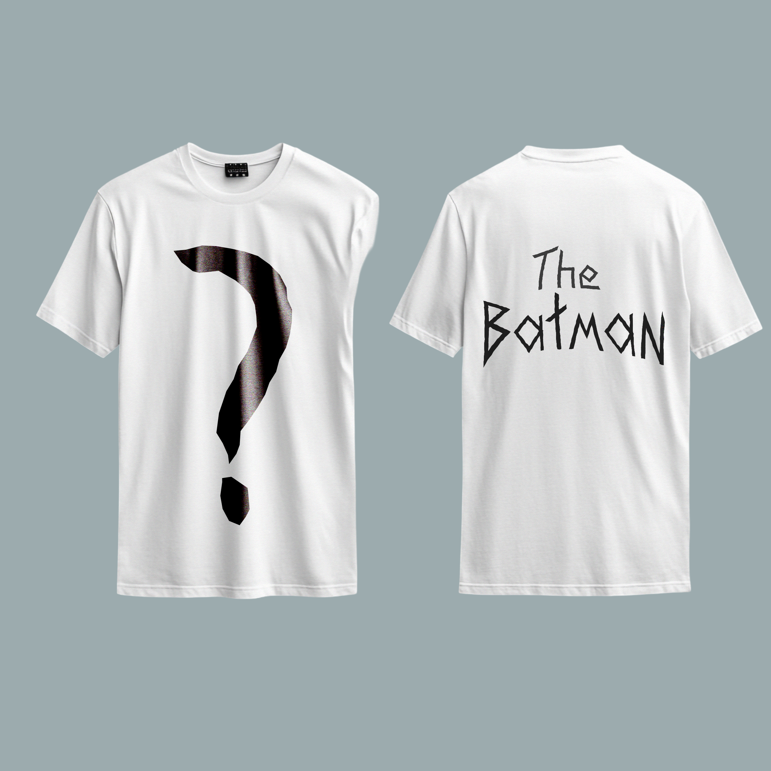
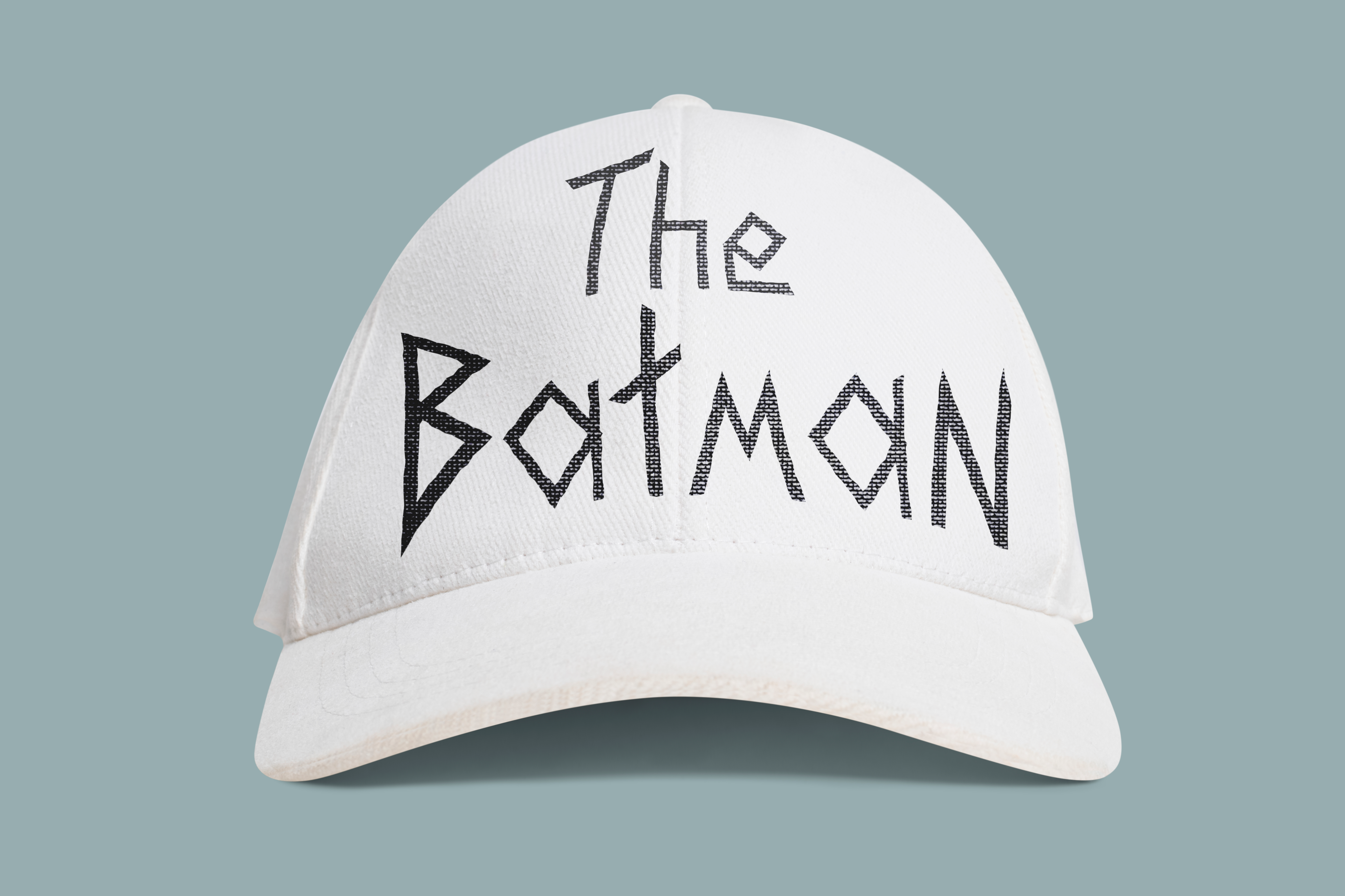
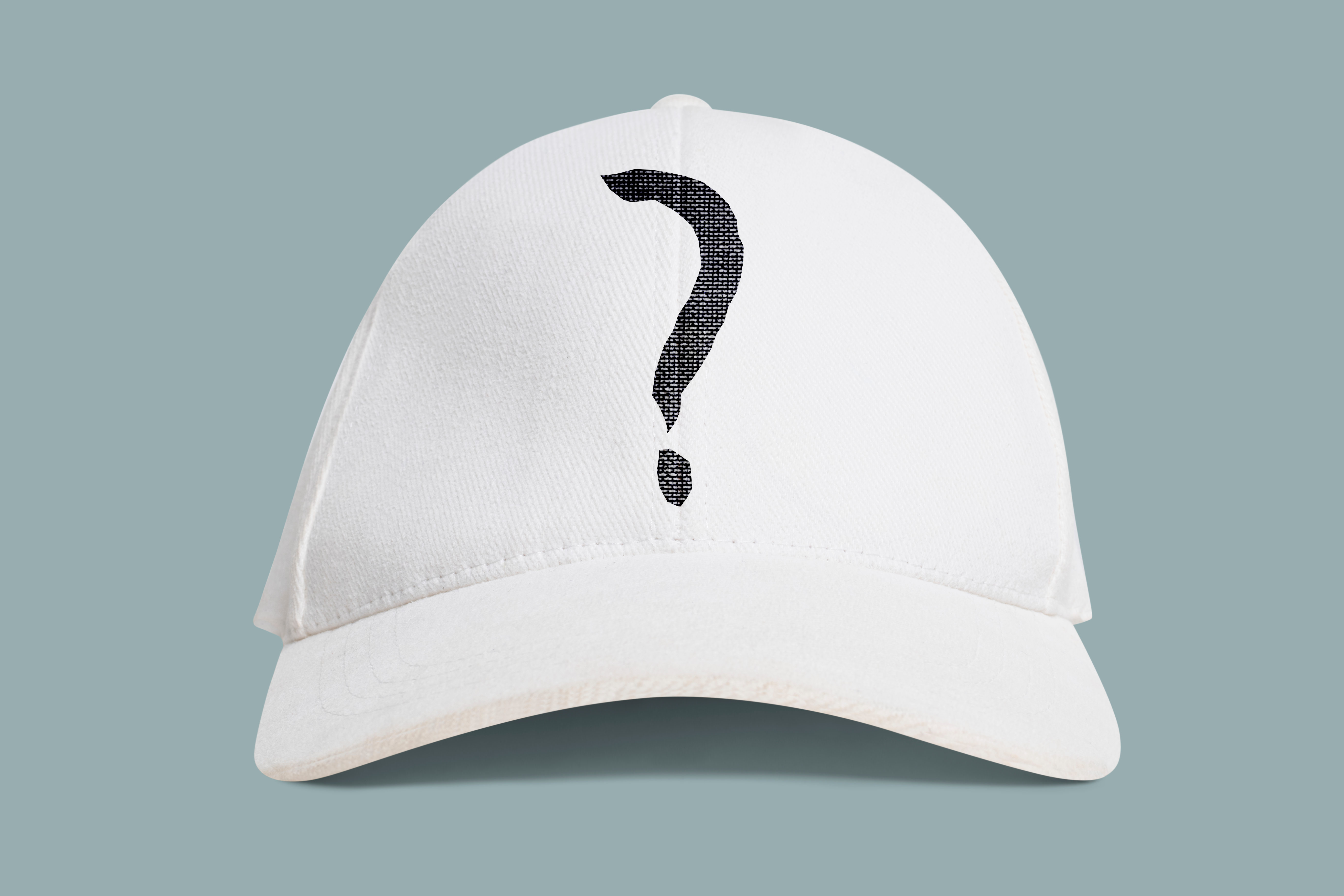
A successful visual identity must be versatile enough to live outside the confines of a digital screen. To test the strength of "The Riddle?" typeface, I expanded the project into a range of physical promotional materials and apparel. By applying the custom glyphs to textured surfaces like cotton and weathered paper, I was able to observe how the jagged, aggressive geometry of the letterforms maintained its impact across different mediums.
The merchandise design focuses on a "minimalist-horror" aesthetic. By utilizing large-scale ciphers and off-center placements on the apparel, I created a look that feels less like standard movie merchandise and more like something pulled directly from the Riddler's evidence files. This final application demonstrates that the typeface is not just a title, but a functional tool for building an immersive world.
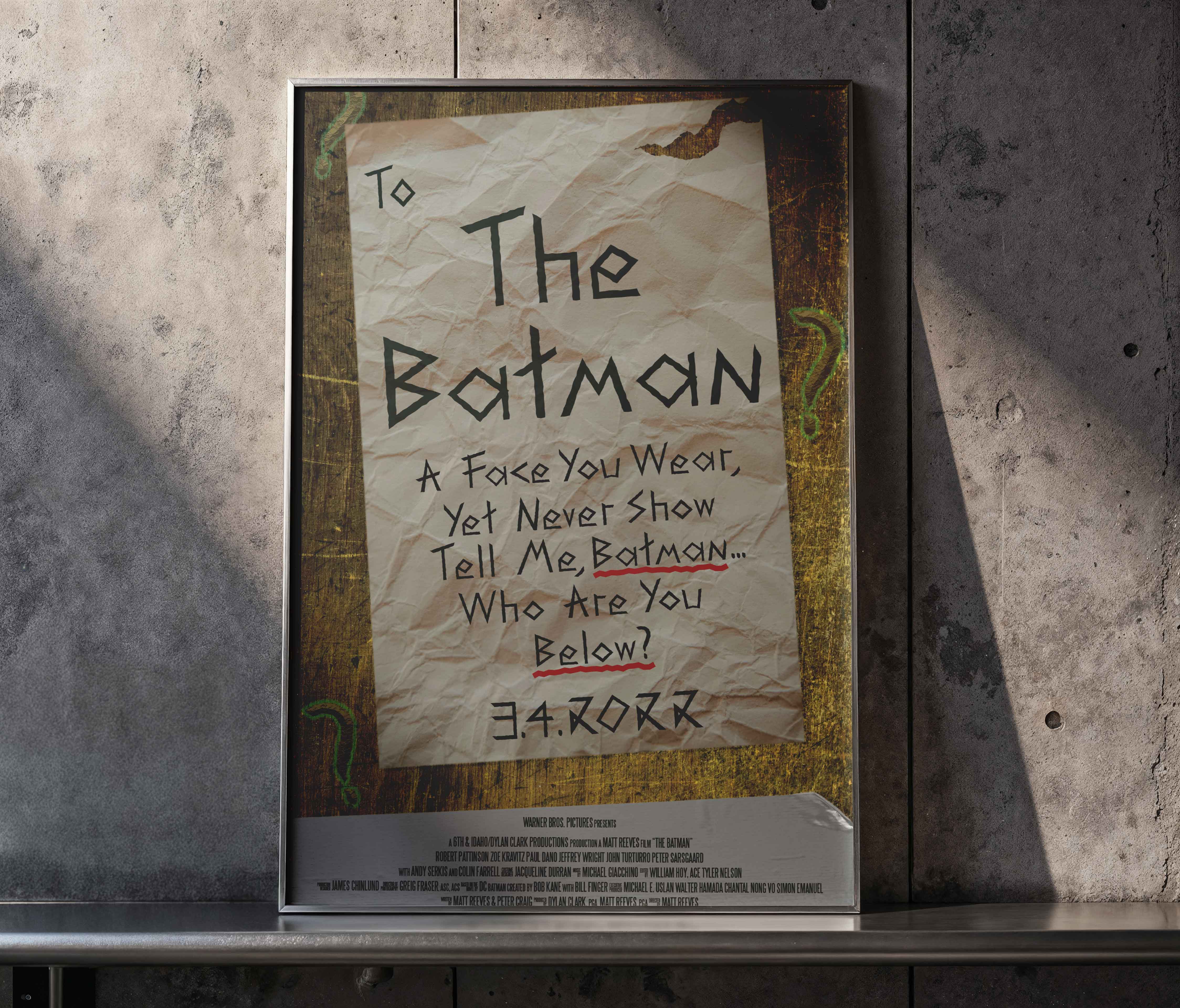
MATERIAL INTEGRATION
The typeface was adapted for various print techniques, including high-contrast screen printing for apparel and large-format architectural displays. Each application was designed to preserve the "carved" texture of the original letterforms, ensuring the brand's tactile, gritty DNA remained consistent from poster to product.